The days are over when a nonprofit website was treated just as a web address where basic information of the organization was made available. Today the non-trading groups also view websites as a strong medium of communication. They hire the best custom web designing companies to get a website that attracts volunteers and donors online. There is a planned approach behind all leading nonprofit organizations’ websites. Their foremost aim is to make it appealing and marketable for web.
Our last post talked about the web design principles of NPO websites and now we are sharing with you a list of websites that are developed along the same lines and are doing pretty well on all fronts (traffic, user experience and conversion). Check their distinct features to know what makes a user interested in an organization.
1. Share the Stories of your Volunteers
Volunteer Louisiana has one of the best nonprofit websites and scores high on user-engagement. The site basically focuses on volunteers, so all you may see on its home page is about people who are associated with it.
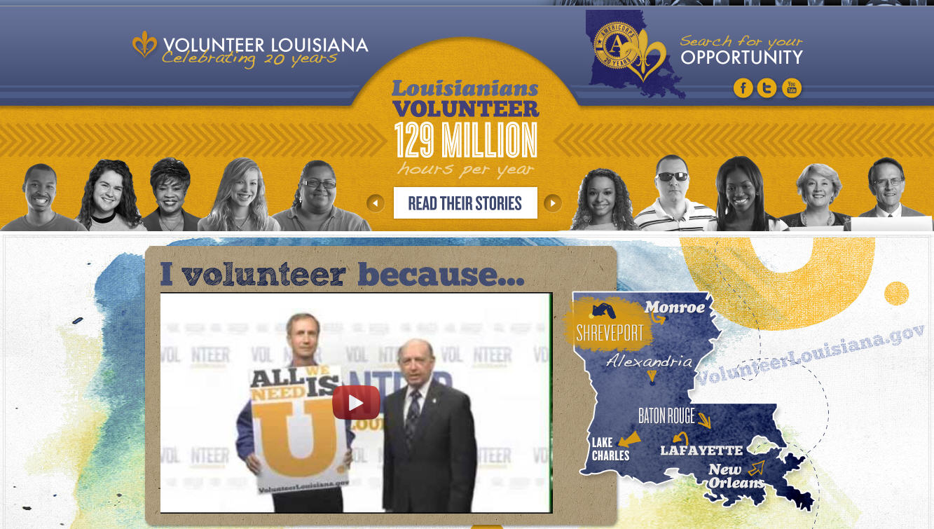
This website is quite an inspiration for organizations which focus on volunteers only. On the top of it we see a slider telling individual stories of volunteers. Scrolling down, you may see video messages of other volunteers along with geographical filter that is integrated in form of a map. You can add such storytelling feature either in text, video or infographical form and target volunteers online.
Exclusive features:
- Well-planned, informal, colorful and nicely executed design
- Well organized information architecture (nicely segmented and only the most important things are put on homepage, rest can be accessed through a link- ‘learn more’)
- Uncluttered design and prime importance given to –‘all I need is u’ i.e. the motto of organization.
- Social media button and contact information on top right
Also Read: 101 ways to make your website engage and sell more
FATbit houses an expert team of designers who build websites that attract more volunteers and donors online
View FATbit’s diverse portfolio
2. Provide Multiple Options when Inviting Donations
The site of Livestrong Foundation is a true copy of modern NPO websites. It is appealing enough to grab anyone’s attention in single glance. It’s not just impressive but communicates a strong message regarding organizational goals and purpose. You can see on the home page that Livestrong invites both participation and donations.
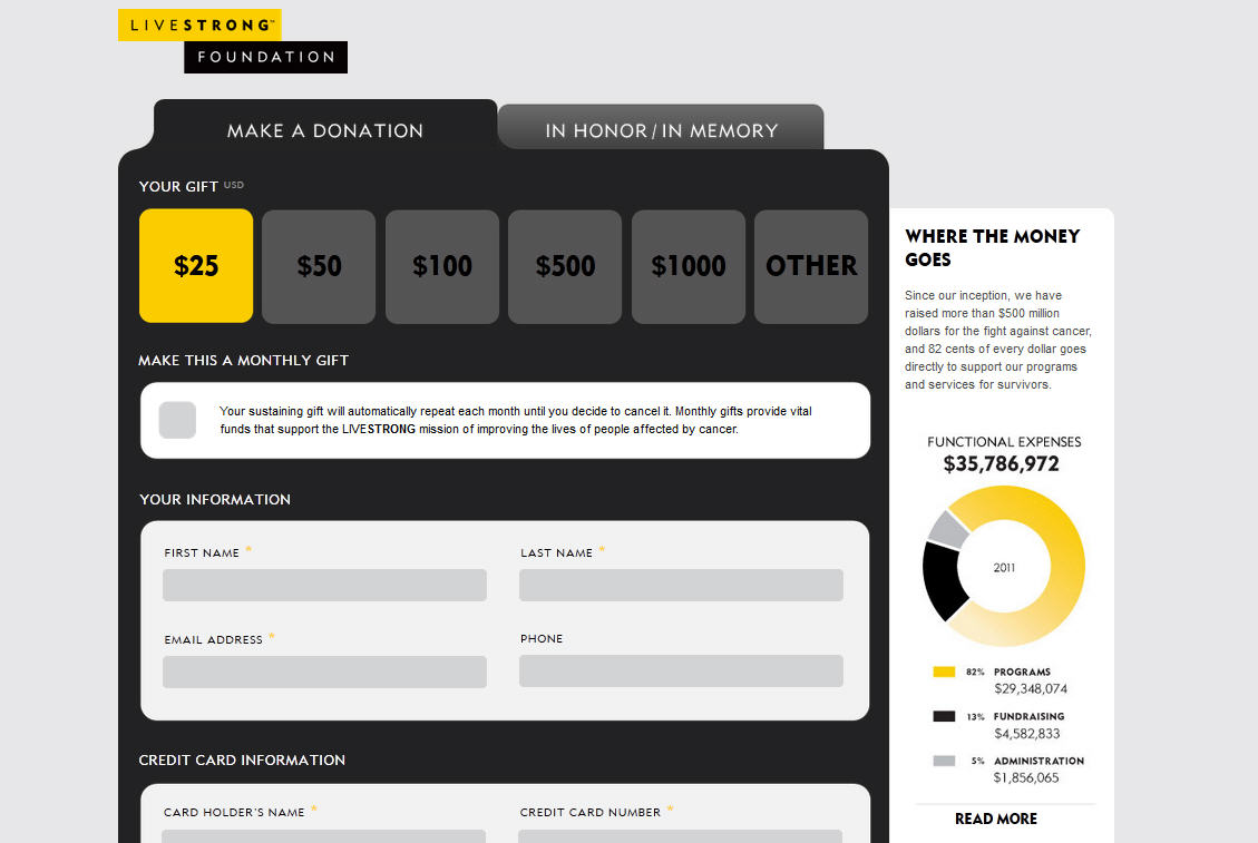
For donation the site gives two options, one is to donate now and the other includes various ways to donate like monthly recurring donations, gift cards, vehicle donations, etc. You can opt for such creative ideas to attract donations from all types of people. Ensure that you conversion optimize such pages just like Livestrong has done;
Exclusive Features of Donations Page:
- The page provides limited navigation options to increase chances of conversion
- Donations amount starts from as small as $25
- Provides the option of making monthly donations
- Highlights important statistics on the side to improve chances of conversion
Also Read: How to Conversion Optimize your website for improved sales?
3. Take a Creative Approach to Represent your Cause
ChernobylHeart an ideal web design inspiration for donation focused websites. It is a rare blend of reasonable creativity and effortless functionality according to the cause they support and their target visitors. The website has a creatively designed header representing mission of this non-profit organization i.e. to save child’s life.
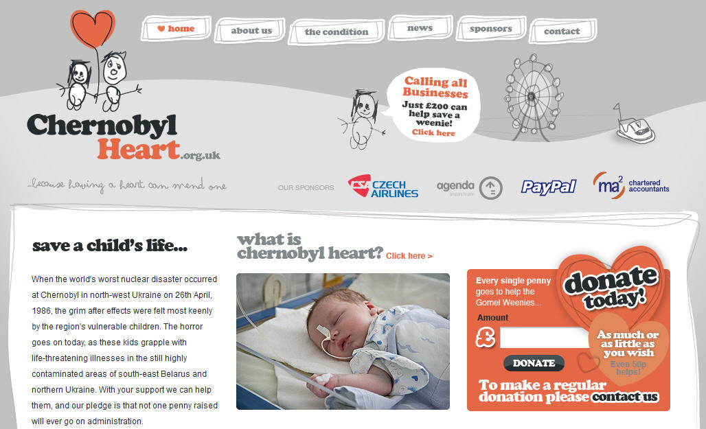
The header has call-to-action image for inviting donations. It sends visitors to another page where all donors/supporter names are mentioned brick wise and one brick is left unnamed with a message (another CTA) taking you to actual donation page.
It is a must for fund seeking websites to make the donation link noticeable to users. Keeping it on the top can prompt donating action easily.
Exclusive Features:
- The Sponsors’ logo in the first fold builds credibility
- Apt designing as per children focused theme and Navigation on the top of page
- Last part includes gallery, social media button and important news
- Space right below the header of main page is also managed quite well and again diverts visitors to the donation area.
Also Read: 7 Valid reasons to redesign your website
FATbit has been delivering good looking, well working and high performing websites from 9+ years.
View our Web Design Packages
4. Clearly Share Information about Your Target
EPS Munro Challenge has a charity based website that focuses on attracting donations. Non-Profit organizations that look for simplicity must follow this web design as it’s quite modest and straight. Home page has acute clarity whether it is about donation, mission, members or charity associated with EPS. There is not 1 but 3 donation links on main page itself that ensure grabbing user attention.
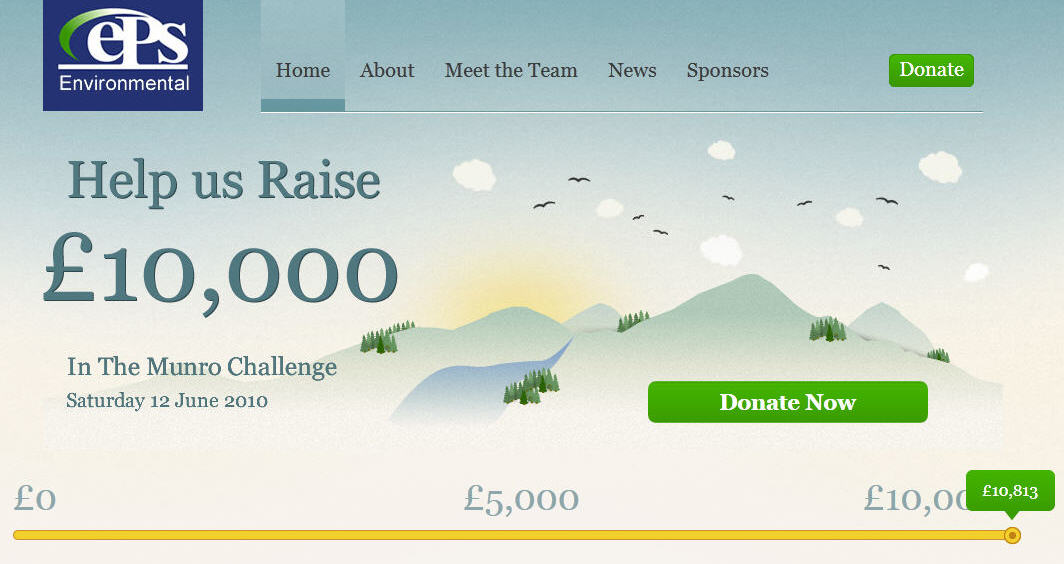
You can also integrate a donation meter like this NPO site, to show how much of funds have been collected and how much is left. It helps motivating potential donors to contribute.
Exclusive Features
- Donation Meter
- Videos on About Us page (Challenges taken in past)
5. Enable Crowdfunding for the Borrowers
Kiva is a non-profit organization that works for connecting people to battle with poverty. It has a worldwide network that enables lending and has 98% rate of repayment. One can easily notice the vast structure of this nonprofit organization in the first look of their website. This is again a finance seeking mission but the organizational model is different so the website also focuses on sharing the needful information with online visitors.
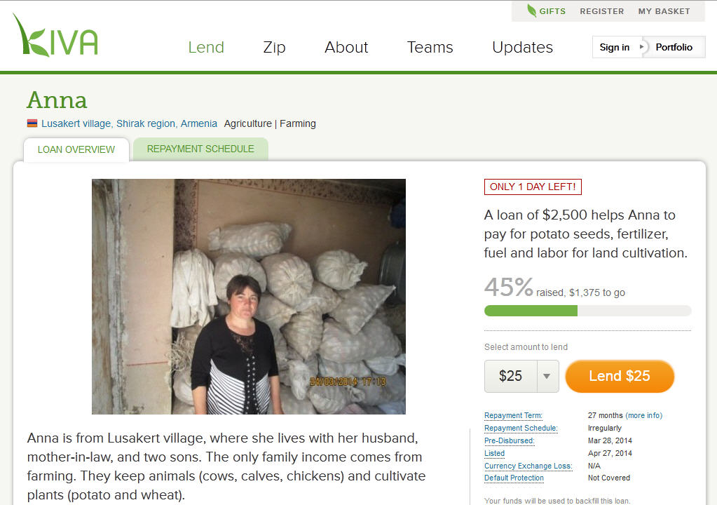
The borrowers can share their stories and ask for crowdfunding from lenders all over the world for their personal cause. On every page there are stories with facts that communicate uncut concept of Kiva.
Follow the distinct features of this website if your organization has a vast network and unique model.
Exclusive Features
- Well-arranged navigation
- Team leader board (Names along with amount loaned)
- Well-structured information architecture
Also Read: How to give your website a global appeal?
6. Build a Community Around Your Cause
iHadCancer’s website is not just a domain but a temple of hope as it is enriched with care and positivity. The website assists the non-profit organization in building a healthy community around their cause by enabling people to connect with each other. The stories of supporters, survivors and fighters are given on the first half as that’s the focus of website (to share and connect).
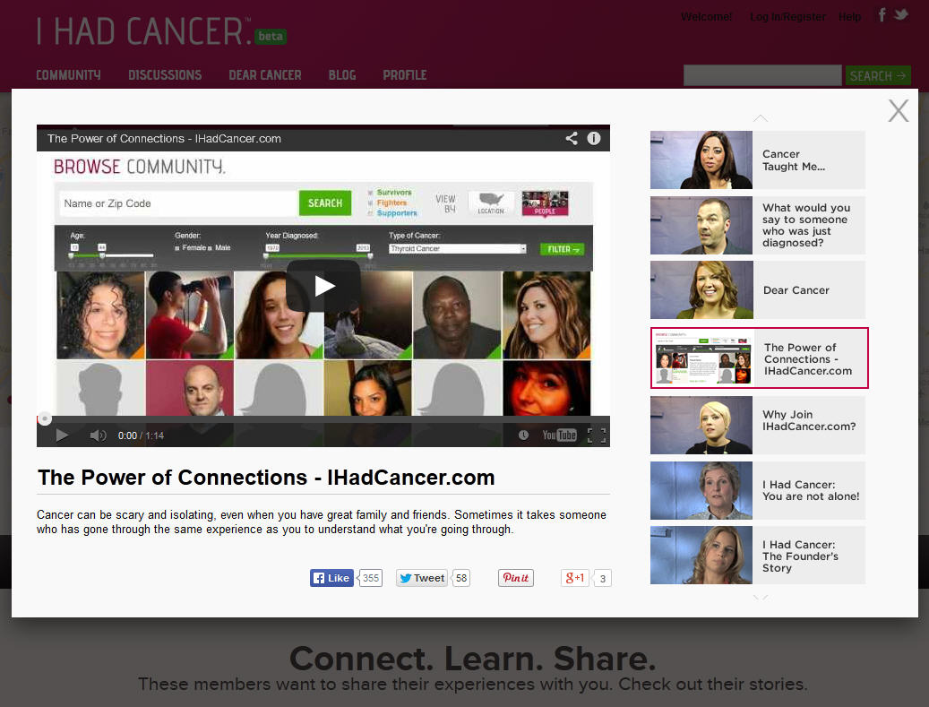
You can do the same through your non-profit organization website by integrating a discussion forum, hosting a blog, sharing videos, etc. Adding a video to a website always adds to its user engaging capacity but talking in context of nonprofit website it has something more to give. It gives audio-visual appeal to your massage and your story instantly finds special place in users mind.
Exclusive features:
- High-spirited Color theme
- Forum to facilitate questions/ answers regarding cancer
- One of the best Nonprofit websites in terms of connection building
Conclusion:
Going through all the sites mentioned above makes you realize the power of design and web marketing. Even though your organization serves a non-profit goal, yet it requires methodical and strategic treatment to lure the visitors for whom you are building an online presence.
It’s high time for nonprofit websites to change and step ahead for reaching out to a vast pool of donors, supporters, volunteers, contributors and participants available online. Hence compromising on the fronts of web design or development makes no sense in current era. You must rather invest in making your mission clearer, understandable and popular on web.
FATbit team can help you successfully plan, build, launch and market your non-profit organization.
Request for FREE Consultation
Comments (4)
 Sadie Prosser
 FATbit Chef Post author
 Rav Smith
 FATbit Chef Post author
Hello, I am a Graphic Designer who designed the above website for a wonderful non-profit organization solely. Photography, graphics, branding and web design from scratch. Loved the inspirational posts of other (much larger) non-profit websites you have posted here and was hoping to get some feedback on our website. Thank you 🙂
Hello Sadie,
Thanks for appreciating the post. The website you shared has lot of room for improvement, you should work more on UX and presentation of content. Our team of UX designers can also help.
Varun
Thanks for sharing such a wonderful article with us, I think the design of the website is also very helpful to engage more visitor to your website. If I talk about your website, when I am reading your article I see links on your blog and when i pointed my mouse on that link they change their look. I think most of the attract by these types of thing the website, most of them click on the links, that is more important to a website to their keep their user at that place.
Hey Rav,
We are glad you liked the post. Thanks for appreciating our blog design.
Cheers