Every online store owner dreams about record online sales and pushes hard every day to improve conversions but very few succeed. While most online stores try to multiply sales by focusing on advertising & discounts, making few changes in checkout process can also help your profit-making cause.
After reading this blog post, you will be able to generate higher sales from the same amount of website traffic. Here are some checkout-process optimization points that will boost online sales without spending a marketing penny:
Be transparent about shipping details
A major reason of shopping cart abandonment is that users are updated about shipping charges at the last step. To avoid last moment loss of sales, maintain transparency in shipping options and charges based on area of delivery, date of delivery etc. Update shoppers about the shipping cost before checkout process. This will build trust in the minds of shoppers and increases conversion prospects in checkout process.
This is critical for online stores with multiple vendors having different shipping policies, charges, speed of delivery etc. Making such small changes in checkout process will help boost conversions.
Inform about product stock-out in advance
Online shopping may be convenient but browsing through product pages to find what you like is exhausting. Thus, no one likes to see a product stock-out popup after order placement and payment. Be very clear on your website about remaining stock for all products, sizes, colors, configurations, etc.
Products saved in abandoned carts and wish-lists must be automatically removed when they stock out. When stocks are limited, an item must be added back to the stock after a pre-set time period to avoid getting blocked in abandoned carts. Not doing this can lead to lost sales.
Well now let us dig deep into the first and most important reason of abandoned shopping carts: Annoying Checkout Process.
Use social login and guest checkout
Online shopping drives majority of its revenue from impulse shoppers. Such shoppers especially do not wish to spend a lot of time registering on every online store. Neither do they want their emails to be bombarded with promotional mails. So, as an online shopping store owner, you need to make the registration process as effortless as possible.
- Allow login through social profiles – With social login feature, shopper does not have to fill in basic details and remember a new password.
- Provide the option of guest checkout – It makes the checkout process quick, convenient and hassle free.
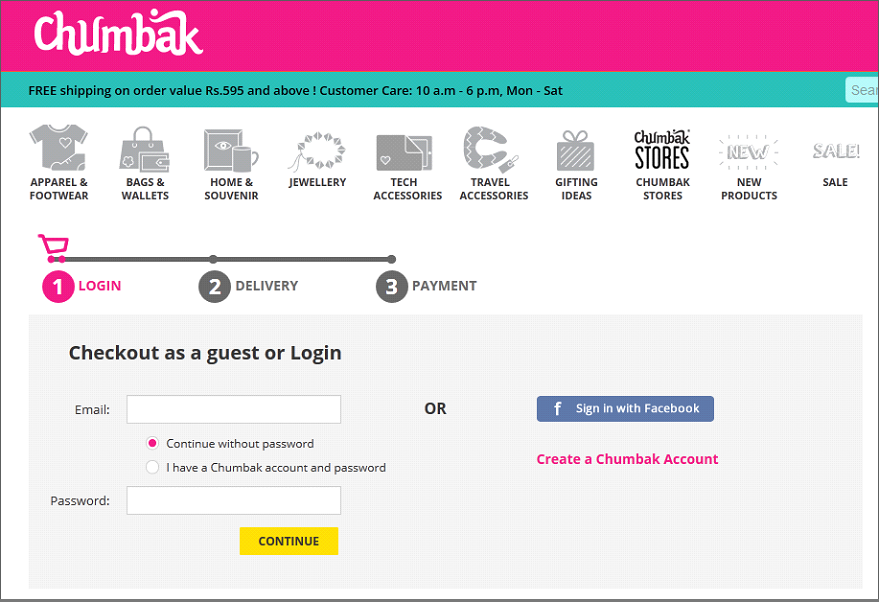
Chumbak has done a great job with this page. The page is very neat and all login options are clearly stated. Optimize your checkout process in such a way to improve store sales.
Clearly state checkout process
Online shopping must be synonymous with convenience shopping. Your website plays a major role in making that happen. A customer who plans to buy from you deserves to know how long it will take to place the order and how many steps are involved. In addition to an optimized product catalog and simple registration process, you must clearly display the steps involved in the checkout; just like TrendIn has done:
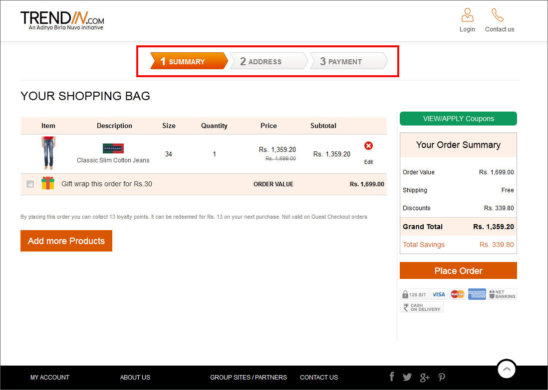
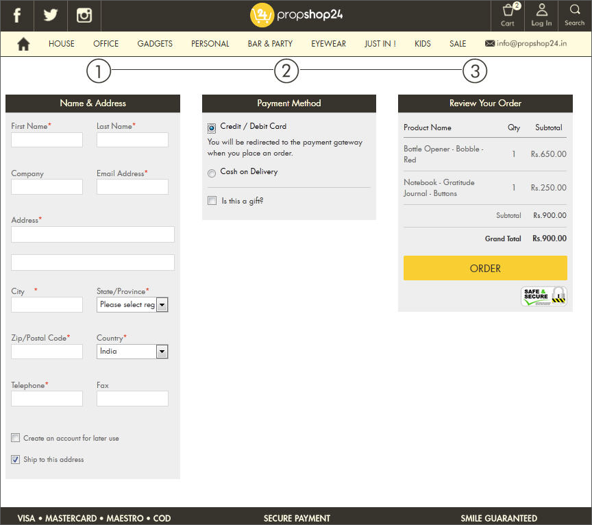
PropShop24.in also tried implementing something similar but ended up stuffing too much information in their checkout page. There is nothing technically wrong with it; it just ends up leaving little space to breathe.
To test what works better with your website visitors, track user behavior for multiple versions of your webpage through Google Analytics. Use data related to Bounce Rate, Exit Rate and Time on Page to get a better understanding of what needs to be tweaked with your website’s checkout process.
Facing problems with your shopping cart?
Limit Navigation
When the shopper is adding products to shopping cart, you can provide shopping suggestions to up-sell or cross-sell. But once a visitor starts the checkout process, limit navigation options. Do not keep your top navigation and footer active.
However, don’t freeze the navigation completely. Just limit options to go back. Provide an option to visit the product catalog and home page. Allow shoppers to contact customer care to clarify any last moment doubts without giving strong visual clues.
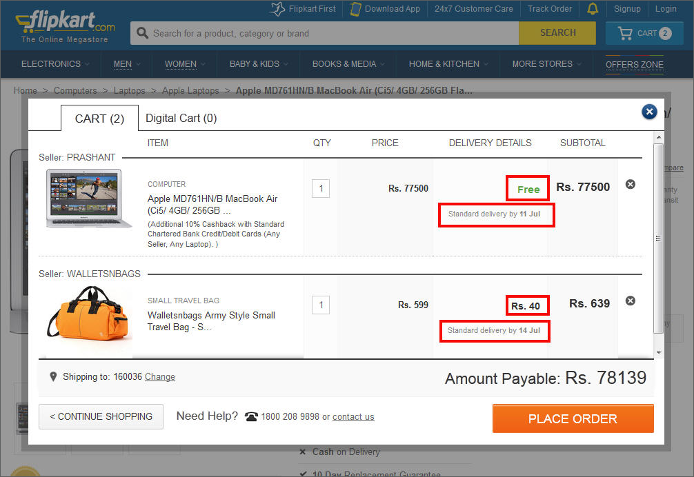
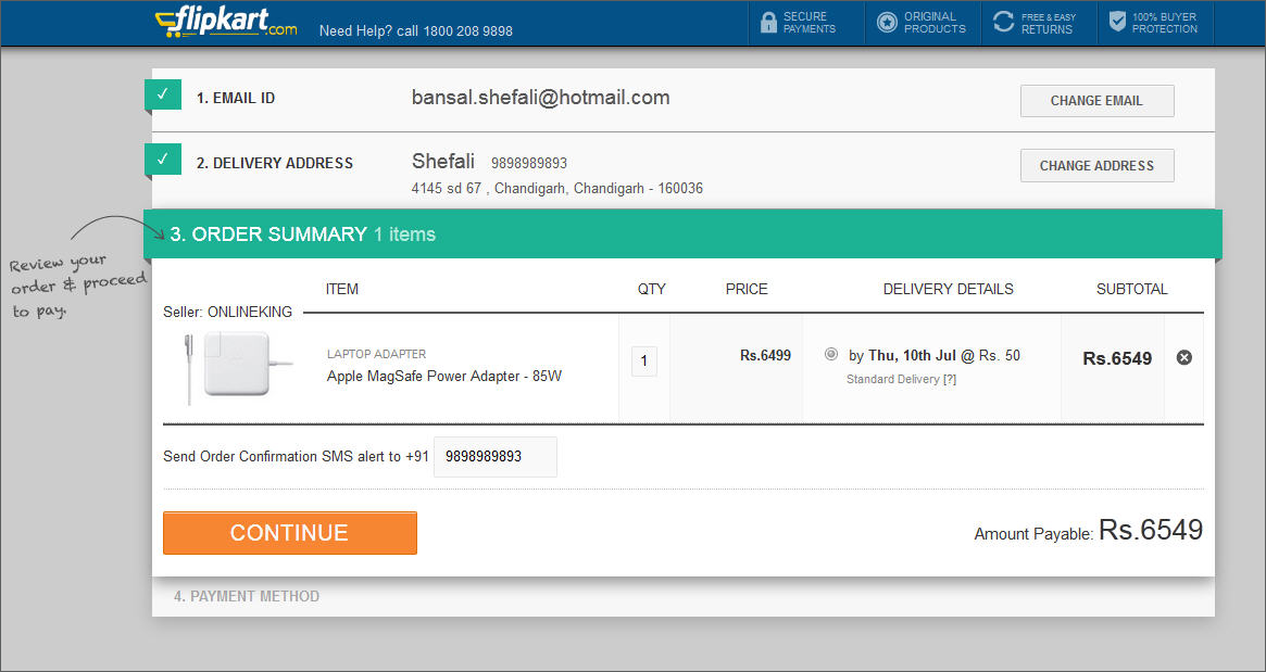
Allow easy updation of checkout details
At every step, a shopper must be able to see what information has already been submitted by him. He must also have the option to go back to a previous stage and change the information already input by him. Flipkart does this beautifully.
Following points will certainly come handy to optimize checkout process for better sales;
- Effective CTAs must prompt him to edit incorrect information.
- A visitor must not be forced to use the browser’s back button
- The checkout process must not start from the very beginning if a visitor goes back to edit details.
- All important information like shipping address, contact details, etc must be stored automatically in user dashboard for subscribed users. In case of repeat purchase, there must be an option to pick up pre-stored information.
Optimize conversion forms
Valued of registered users cannot be ignored even if you offer guest checkout option. Increase the number of registered users by making the registration process simple and quick. Jabong is using an effective pop up as a registration form;
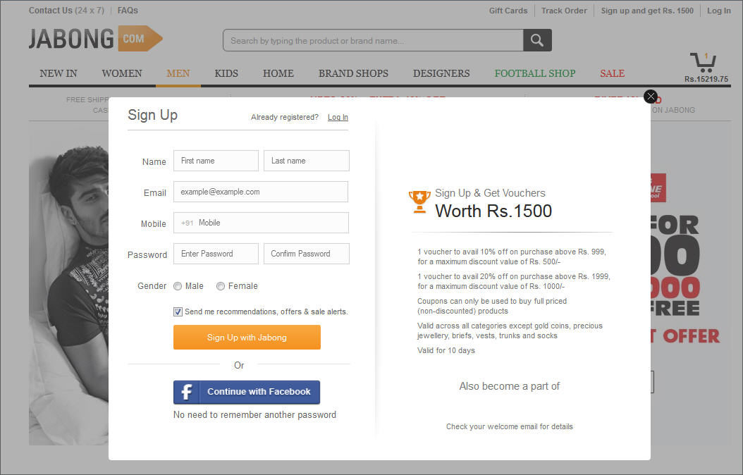
- The form is compact and clean.
- It does not ask for redundant information.
- There are no unnecessary details.
- It doesn’t freeze the website.
- There is a social media login option too.
- There is a preselected option for the company newsletter.
- Monetary benefit in exchange of signup for new visitors.
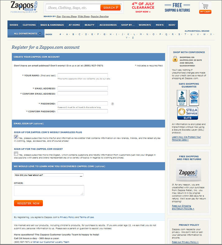
What Jabong did with a small popup, Zappos failed to accomplish with a full-fledged page. Its registration page is cluttered with company credentials, multiple newsletter options, terms and conditions, and what not.
The shipping information and payment details collection forms must also be planned on similar lines. Optimize your website’s conversion forms with these points;
- The city and state must be auto filled once the pin code has been filled in.
- You must not have multiple columns to fill in the address asking for street name, nearby landmark, etc.
- There must be transparency of charges for payment options like cash on delivery.
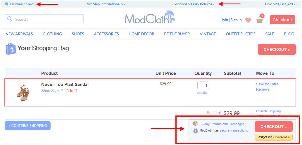
Add trust building elements
Include client testimonials, security badges, payment options, return policy, and customer support visuals to increase conversion prospects. Even if a user is not looking for this information, such elements build trust and give shopper another reason to purchase. Where and how you place these elements is also crucial. ModCloth has placed them in the page header and just near the checkout button.
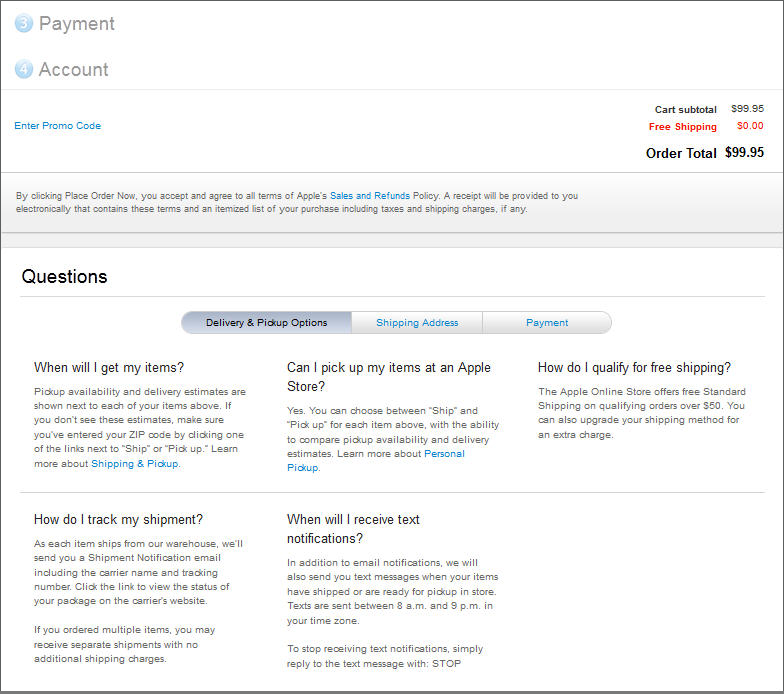
Add information to your checkout pages that answer buyer’s doubts. This is particularly important to boost conversions of a checkout process when the product/service being sold is of a high value. Apple includes an FAQ section under its checkout page. All these are successful examples of optimizing a website’s conversion funnel.
Utilize thank you page
A user who reaches the Thank You page and leaves your website is also a loss of future conversions. Such a visitor can become a repeat buyer if provided with right options.
- Suggest your customer to buy complimentary or related products or services. Make them available at a discounted price for a limited time period.
- Ask them to fill out a survey about their shopping experience. In return award them with a discount on their next purchase.
- Request buyer to share the news of recent purchase with friends in exchange of a referral discount on next purchase.
- Make your return policy very transparent to avoid any last moment cancellations.
Evaluate your website’s checkout process for above mentioned points to sell more from the same amount of traffic. If your checkout process is fine but your website sales are still low as compared to incoming traffic, there might be other issues with the conversion funnel.
The point is you don’t need to invest in marketing and advertising to increase online sales. Simple website upgrades can do the trick.
Do you have something to ask? Share your questions in the comment section and our experts will answer!
Have any queries regarding the Checkout Process?

Comments (2)
 Haresh Pansuriya
 FATbit Chef Post author
Hi Varun really Useful Tips to Make user friendly websites.
Hello Haresh,
Thanks for appreciating the post. Keep coming back for more such interesting posts on website UX and UI.
Cheers,
Varun