What makes some mobile websites easy to navigate and understand while others easy to hate and forget? User interface is the major difference maker if you want to make visitors stay, browse and buy from you. In this post, we will help you in making sure that the user experience of your mobile website or application is loved by users and generates real benefits for you. This post is FATbit’s effort towards answering all basic queries like:
- What is wrong with the mobile version of my website?
- Why is the visit duration of the traffic coming to my website so low for mobile devices?
- What are the best practices for mobile user experience (UX)?
So here is a list of 10 things that might be wrong with your mobile website and need optimization from a web design expert:
1. Miniaturization vs Mobilization
Webmasters with limited mobile optimization knowledge think that making website components smaller solves everything. Such a narrow view makes mobile usability and user experience take the back seat. Optimizing for mobile devices is not just about making graphics smaller. Your understanding of miniaturization and mobilization decides where your website or application ranks on the user experience.
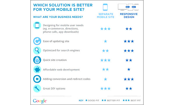
Mobilization means building mobile platforms by using latest technology (XHTML, HTML5 and CSS3) while adhering to mobile UX best practices. With the changing user habits and preferences, your website can’t just be mobile friendly; it needs to be ‘built for mobile’. Choosing between a responsive website, adaptive website or mobile app is the first step towards mobilization.
2. Don’t Ignore Platform UX
Mobile OS development companies like Google and Apple spend a fortune in R&D to build user friendly interfaces. They study how people use mobile devices and build software in such a way that users intuitively know when they need to swipe or go back.
Follow these conventions so that your users are not forced to learn a new way to navigate. Building a unique mobile UX means ‘sticking to the basics for some things and experimenting with the rest’.
3. Technical Limitation
Develop your mobile website or application keeping into consideration the most basic mobile device users. Building something that has advanced hardware requirements will limit your reach. An application or website that drains battery or takes up large disk space will completely destroy mobile UX. The easiest way to avoid such a pitfall is to know your limitations, set guidelines and test as often as possible on a wide variety of devices. The process should not stop post launch. There is always scope for improvement.
4. Small Screen Considerations
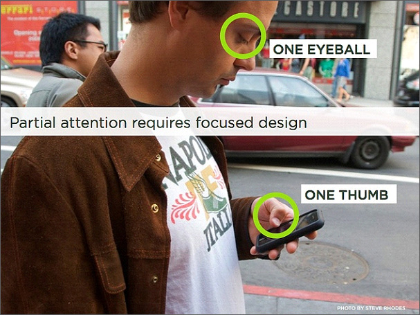
A small screen of a mobile device leaves you with very limited space to play around. Mobile website optimization is all about prioritizing and limiting the content being displayed. No one has the patience to wait for a long page to load and read lengthy details.
So, only place your main content and strategically place relevant call-to-action buttons. The ideal position of your CTA is at a thumb’s reach. It should be big, bright and easily accessible. The CTA should be placed such that a user can operate his phone with a single hand when on the move. Have a look at the image for better idea.
5.Finger Friendly Design
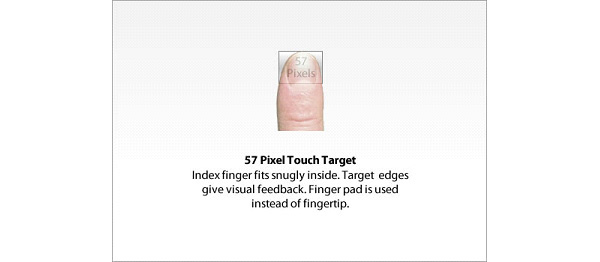
Now that you know where to place the main CTA, let’s see how to plan the mobile UI for other buttons. Even the smallest button on the screen is a touch target. It demands more user attention and effort, slows down navigation process, and at times, leads to errors. If you are planning the mobile user interface for an ecommerce website or application, the last thing you want is to slow down the buying process.
Mobile UI best practices suggest that a target button should be approximately 45-57 pixels wide to allow a user to comfortably fit their finger. This will allow them to not just press the button but also see where they are clicking from the edges. Such small visual feedbacks contribute to great mobile user experience design.
Design experts at FATbit strongly agree that the best design is invisible. It’s a part of the interaction, information architecture and requires limited user effort.
 6. Intuitive Navigation
The navigation of your mobile website needs to be clear, intuitive and easy to use in the absence of a mouse to point and click. Here are a few things to always look out for:
- Your visitors will start looking for the main menu when they land. The menu is usually replaced by a button and opens as a vertical list on a mobile device.
- Prioritize and reduce the number of categories and levels of navigation.
- Use clear and consistent buttons for navigation across the site.
- Have a footer that connects to the home page and some primary service pages.
- Promote sharing through visible social media sharing buttons.
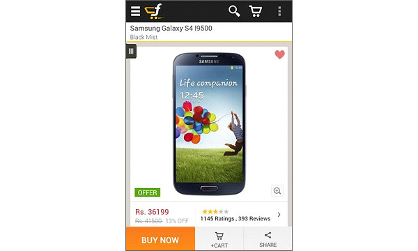
- Keep the search option and shopping cart easily accessible on every page. Just like displayed in the screenshot of Flipkart online store.
7. Guide First Time Users
Do not assume that a first time visitor knows how to use your mobile website. Just assume his discomfort because it looks a little different from the desktop version. The best way to restore order is to guide visitors about location of the menu and how can they navigate to the next page.
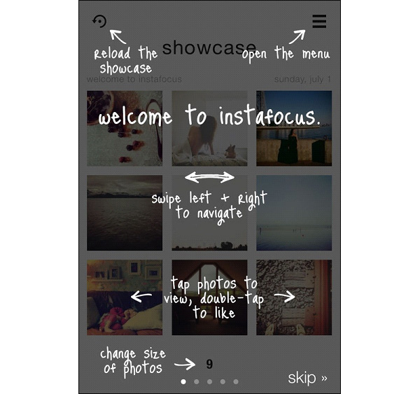
This can be achieved easily through hand annotations as you see in the image above. It acts like a brief tutorial. This tactic is usually adopted in mobile apps but who says it can’t be used for your mobile websites.
8. Save Important Information
People are more comfortable making payments through mobile phones ever since mobile ticket booking became the norm. To acquire such mobile purchasers, make the buying process as quick and effortless as possible.
In case you have an online store, allow visitors to save basic information like shipping address and credit card info. They should be able to enter details and make payments in fewer steps.
Introducing an option of digital wallet can be helpful. Some additional plug-ins can enable visitors to scan their credit card which is much easier than punching in all the details every time. Companies like card.io and Braintree make mobile payments easy.

Allow visitors to register or login through social media platforms. If you have a mobile app, then, enable it to pickup login details from mobile apps of other social media platforms installed on the mobile device.
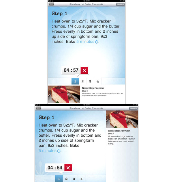
9. Understand the Context of Use
Always start mobile website and application design with context and circumstance of use in mind. This is particularly important when designing for device orientation. Taking a cooking app as example; the default orientation is a portrait where the user will flip through the pages and read the recipe. But when using this mobile device in the kitchen while cooking, the orientation will change to landscape. What you can do is introduce larger icons, allow audio directions, prevent auto dimming of the screen and maybe give a preview of what is there in the next step.
10. Track and Analyze Visitor Behavior
Keep a track on your Analytics account to study visitor behavior and performance. If your mobile visitors show a high bounce rate on all or a particular operating system, ask your mobile website design company to check for issues like UI errors and loading time. Stay informed about how visitors are behaving and keep optimizing. Some important parameters to track are:
- Visits.
- Overall bounce and exit rate.
- Browsers and devices used.
- Repeat visits.
- Number of pages browsed.
- Bounce rate of every page for various devices.
- Exit rate of every page for various devices.
User experience of a mobile website contributes hugely to sales and conversions. Hence, those looking for mobile profits cannot afford to ridicule the UX concepts. Similarly, it is also important to analyze traffic and visitor behavior from multiple devices.
In case you think your mobile platform is scoring low in UX or performing below expectations, then, a single consultation session with UX experts in mobile web design can greatly help.
Want to launch the mobile version of your regular website? Get in touch and start generating sales from smartphonesContact Mobile web design experts


Comments (10)
 Web Design Company
 Jerilyn
 Irwin
Irwin
 July
July
 FATbit Chef Post author
 Jenny Ross
 Melody Kopp
 FATbit Chef Post author
 Katarina Lopez
 FATbit Chef Post author
It is good to apply responsive web design on your business website. Responsive websites get better response on search engines.
Magnificent website. A lot of useful information here.
I am sending it to some friends ans also sharing in delicious.
And obviously, thanks for your sweat!
Hey there, You have done a fantastic job. I will certainly digg it and personally suggest to my
friends. I’m sure they’ll be benefited from this web site.
Nice tips! Designing user experiences for the mobile web is very challenging but worth the effort.
Hello July,
Thanks for appreciating our tips on mobile user experience.
FATbit Chef
such an interesting blog! Thanks for proving the knowledge on how to make a user-friendly website.
Thanks for sharing this amazing tips, FATbit Chef.
These are some outstanding tips you mentioned in the article if you want to design an outstanding mobile ux. To be on the competitive edge, every eCommerce website should have a high- quality UX design. Without it could hurt the sales and revenue in different stages.
Hello Melody,
You are absolutely right. High-quality UX design is imperative! Thanks for your appreciation though. Stay tuned for more insights.
Regards,
Team FATbit
Thanks for sharing this article.
Looks amazing. With eCommerce website development, the mobile user experience design strongly puts focus on discoverability and efficiency.
Hello Katarina,
Thank you so much for your appreciation. Stay tuned for insights!
Regards,
Team FATbit