Last Updated: 3rd March, 2021
Sales reps are no longer the first mode of interaction between businesses and consumers. That place has been taken up by the internet, which daily attracts millions of new users. In this circumstance, it is vital for brands to understand how consumers prefer to interact with businesses online.
After analysing consumer behaviour and their interaction with web pages, we have come up with this article. It contains most effective touchpoints to engage users and assist them in completing their desired actions.
Read below to see the touchpoints and how various brands utilize them for customer interaction.
Captivating Touch Point Examples to Improve Interaction and Optimize Customer Experience
The following touchpoints have been precisely created to increase interaction between the website and visitors. You can implement them in your website to improve the overall design and experience.
1. First Fold of the Homepage
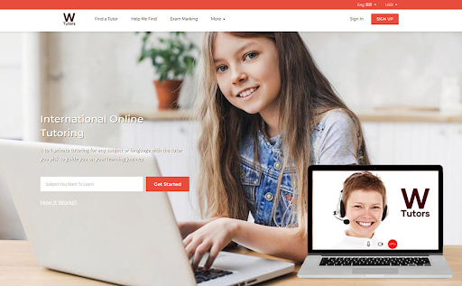 Source: W-Tutors
The 1st fold of the homepage is the first thing your visitors see when they visit your website. It needs to be attractive, user-friendly and clutter-free. Most companies utilize their front fold by providing an “enter email” field to interact with the brand. It is an easy way to connect with customers and improves navigation.
2. Newsletter Subscription Bar
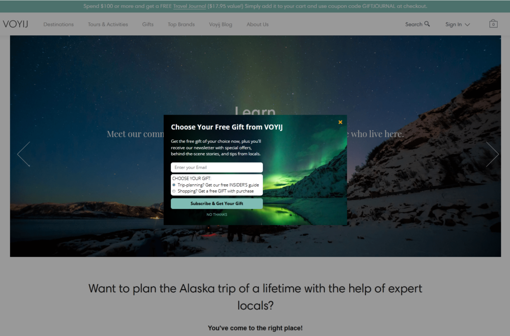 Source: Voyij
Businesses can ask visitors to sign up for email newsletters in a variety of ways. One of the most effective ways is to request the visitor via the newsletter subscription bar. It is easy to fill and does not misguide visitors. They know they’ll be signing up to receive your blogs and promotions in their inbox and can contact your brand with ease anytime they want.
3. On-Page Contact Form
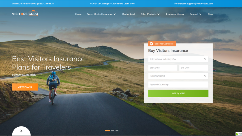 Source: Visitors Guru
The main goal behind on-page contact forms is to collect appropriate details about your customers before they contact your brand. This helps businesses provide more personalized experiences and target high-quality leads. A business can add various types of fields in the contact form.
4. Free Product Demo
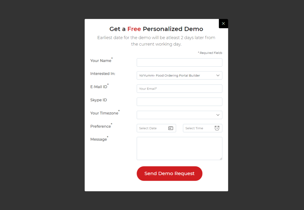 Source: FATbit
Consumers prefer receiving free demos of products before making a purchase. It keeps things transparent and assists in increasing conversions and trust. Brands who incur major expenses in providing free demos can limit their number to 1 free demo for each customer.
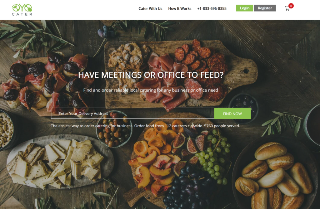
5. Testimonials from Clients and Partners
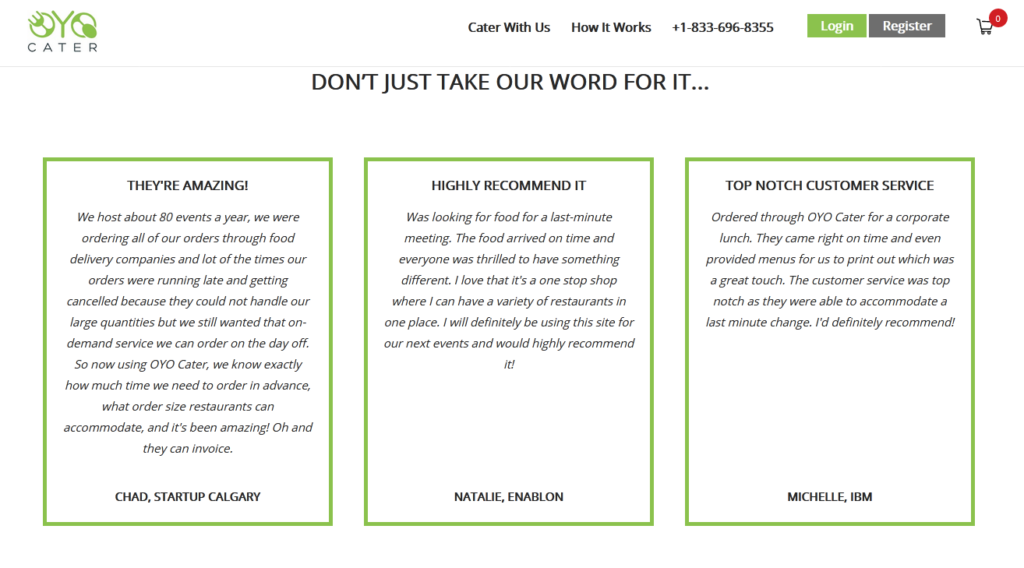 Source: Oyo Cater
Client testimonials motivate consumers to interact with the brand. They act as a trust-building element that progress the buyer’s journey towards conversion. There are several client testimonial formats that a website can use. It can also integrate a ‘Contact Us’ button with the testimonials section to use the section as a subconscious CTA.
6. Author Bio
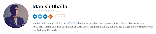 Source: Entrepreneur
A short bio with a link to a landing page can help businesses create a distinct profile. If you plan on investing time and money to establish your presence on a third-party website, then focus on bringing value through content as well. Furthermore, you can use big data and content marketing to reach the right customer.
7. Live Chat for Answers to Questions in Real Time
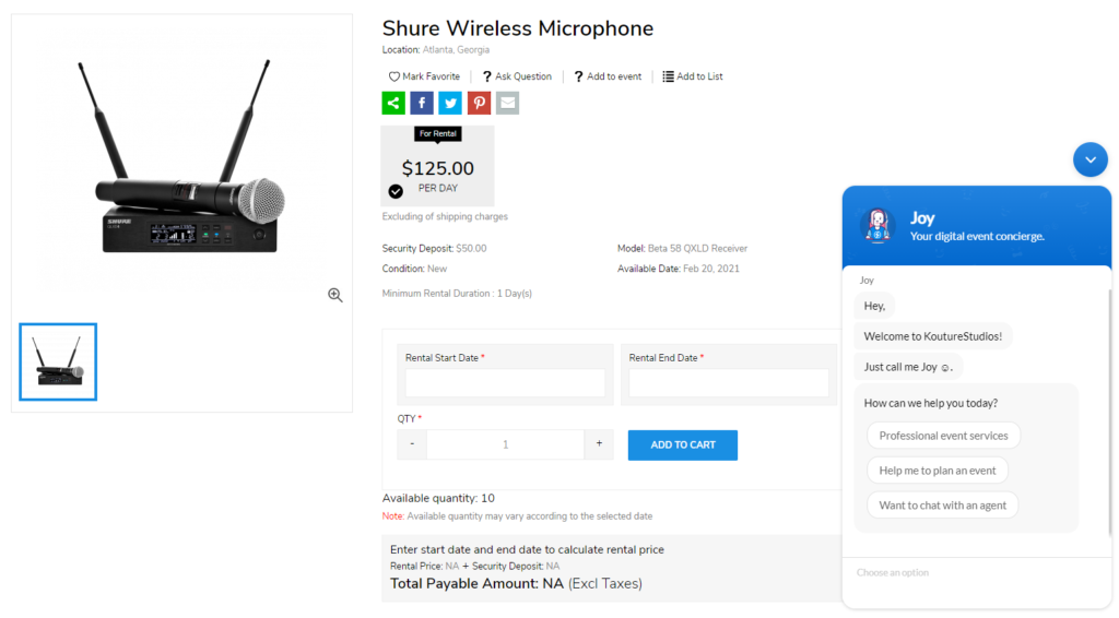 Source: KoutureStudios
Consumers in every sector expect brands to provide fast and reliable customer service. They don’t want to navigate through the traditional IVR systems and want ease in finding customer support. In such a scenario, providing chat support via your websites is a very helpful option. If you cannot provide real-time support, then several AI-enabled chat integrations are also available.
8. Comments Section
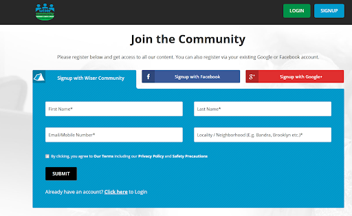 Source: Wiser Community
Consumers consider comments and reviews a genuine source of information about a company or its products. They also use the comment section as a way to approach brands to clear any queries and doubts. This is especially common on blog pages. Also, consumers replying and interacting with other consumers also increases the website engagement.
9. Social Media Sharing
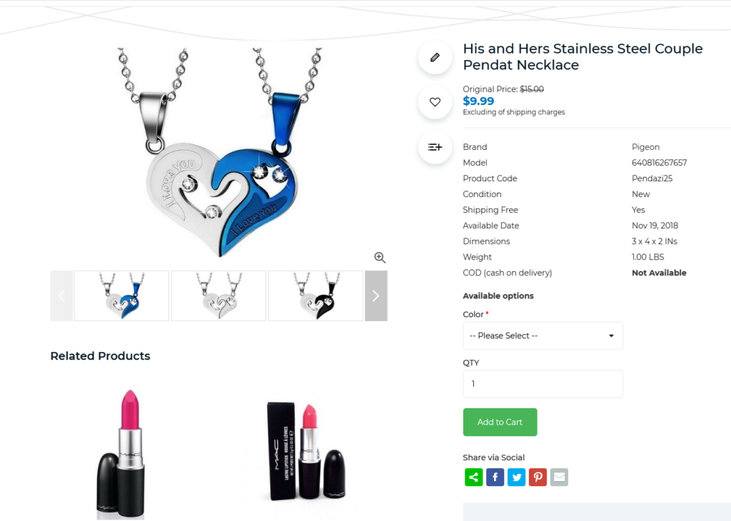 Source: Pendazi
Social media buttons enable visitors to share your products on their social media handles. This does marketing for your brand and helps visitors and influencers get a third-party opinion from their followers. Platforms like Facebook also provide a private message option, which is an upgrade to traditional social media sharing.
10. Pop-ups for Product Demo
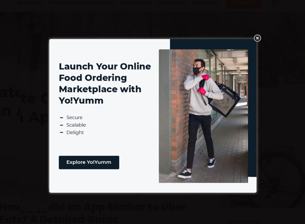 Reference: Yo!Yumm
Pop-ups with a light and functional design that are timed well enhance the user experience. They assist in customer retention, and product demo pop-ups even introduce your products to visitors. There are various types of pop-ups that you can integrate into your website, such as exit-intent pop-ups and timed pop-ups.
11. Call-to-action Text – Inside Post
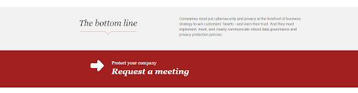 Source: PwC
Depending on the funnel stage a market asset belongs to, businesses can place various types of CTAs inside their blog posts. Contrasting colors, urgency, desire and preciseness in CTAs makes them most convincing and useful for business websites.
12. Push Notifications
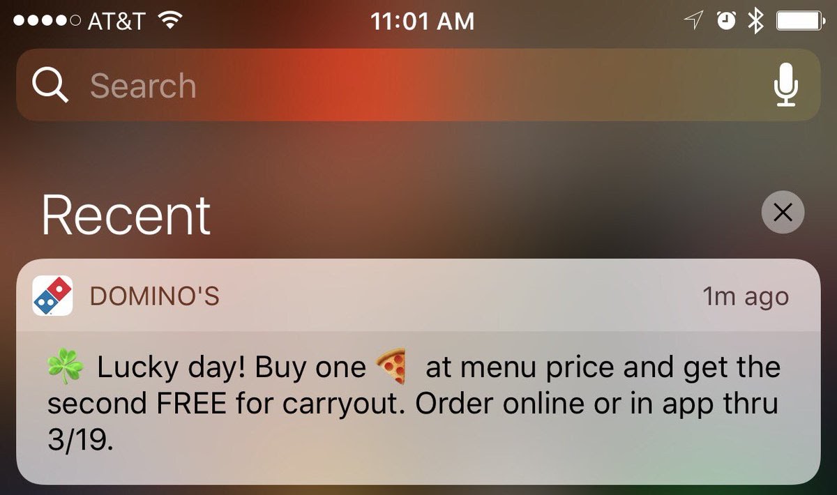
Push notifications remind users to visit your store on an intermittent basis. eCommerce businesses have been using push notifications as a means for promotion and interaction for many years. Whether the user will click on the notification or not, it depends on the ad copy you sent. Also, push notifications can be sent on both computer web browsers and mobile phones with the later being more popular. They are a different type of CTAs with a very high chance of users reading them.
13. Email Signature
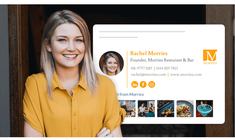 Source: WiseStamp
Email signatures signify a logical conclusion of your communication, making them noticeable to the users. A well-structured email signature amplifies brand image and can be used to convey important information just like the example shared above. This email signature has the primary contact number of the business along with the email address and the website for the receiver’s reference. Furthermore, links to the company’s social media handles advertises brand footprints and enhances brand awareness.
14. Survey Participation Request Form
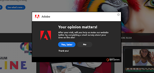 Source: Adobe
To use surveys as a touchpoint, businesses can frame questions that are no hassle for their website visitors to answer. In the above example, the form is not shown upfront. Instead, it appears as a popup, asking the visitors if they would like to complete a short survey. A click on “Yes, later” will open a separate window to which the visitors can come back to at a later stage.
15. Landing Page CTAs
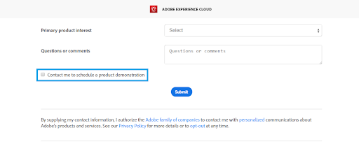 Source: Adobe
Many brands have configured a default contact button in the navigation bar of their website. As a touchpoint, a simple ‘contact us’ button is not so convincing and does not deliver value. Instead, brands can ramp up their landing pages by providing in-context CTAs that align with the buyer journey and assist in conversions.
16. Refer a Friend
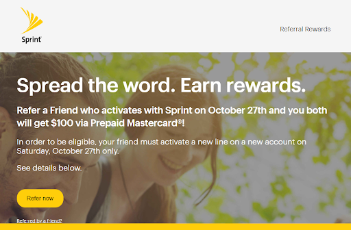 Source: Sprint
Rewarding consumers for referring your products to family and friends can also increase website engagement. It is good for business promotions and the reward only needs to be given incase of successful referrals, which means when a referred person actually buys your service or product.
17. Search Bar
 Source: Oyo Cater
In a world, where consumers are hungry for experience, search bars should be made to bring convenience. In the above example, the search bar is the most prominent touchpoint, motivating visitors to interact with the brand. Any other type of web element or touchpoint would have taken away the convenience of finding products from consumers and resulted in poor conversions.
18. The Hover Effect
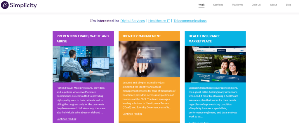 Source: Simplicity
Website design practices like hover effects use animations to improve the user experience of visitors. For example, a change in the color of an element when a visitor moves his mouse over it is an example of the hover effect. Using the combination of various animations and colors, brands can use the hover effect to increase clicks and user engagement.
19. Internal Linking
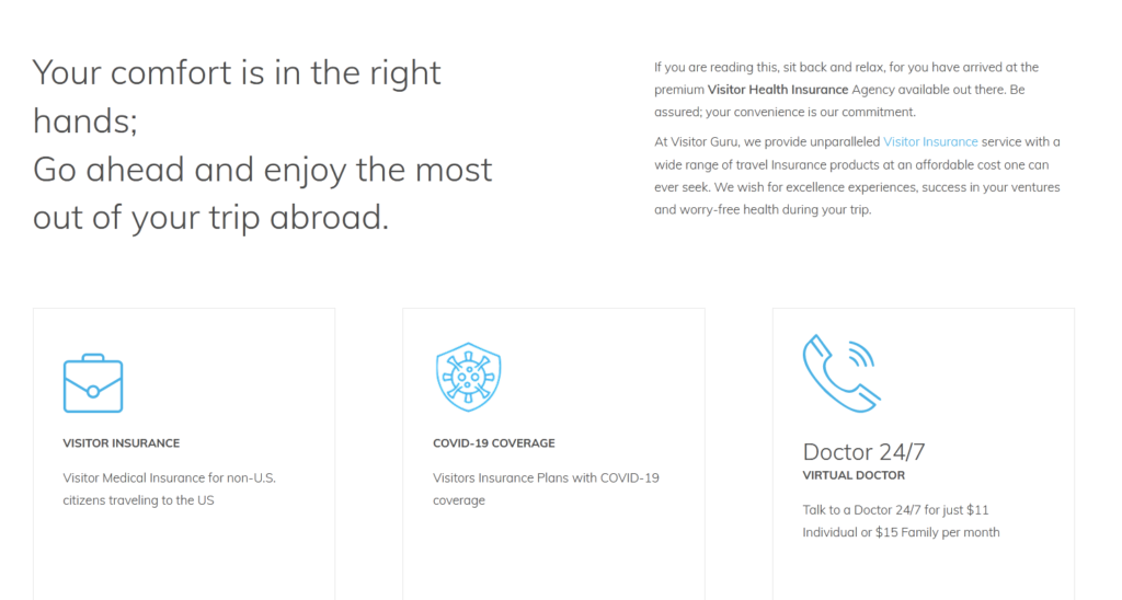 Source: Visitor Health Insurance
Internal linking has two benefits – enable a website visitor to explore the topic and improve ranking in search results. Ideally, keeping the sales funnel in mind and inserting appropriate internal links can lead visitors to the final purchase decision stage of the buyer’s journey.
20. Call-to-action Text – Side
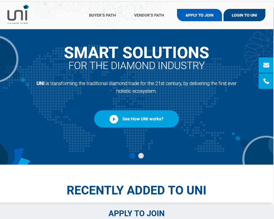 Source: Uni Diamonds
Concealed CTAs that popup once a visitor takes an action also work as feasible touchpoints for brands. For example, in the given image, Uni Diamonds is using mail and call logos to conceal CTAs. Not only are they improving user experience, but also making the web design clutter-free.
Due to the presence of uncountable websites, consumers today have varied experiences in interacting with online businesses. In these circumstances, clear-cut digital touchpoints assist businesses in providing their consumers a direction to interact with their websites. Moreover, integrating these touchpoints not only improves a brand’s web design but also ameliorates the customer experience and encourages interaction.
Majority of the websites mentioned in this article are developed by using FATbit products. To get a website with similar UI/UX design, you can check out our wide range of products or feel free to contact us for custom development.
Hire Experts to Create Captivating Touchpoints Button

Comments (1)
 redactie
Thanks a lot for the article post.Much thanks again. Fantastic.