Steve Jobs once famously said that “Design is not just what it looks like and feels like. The design is how it works.” For a long period of time, websites globally have been built on the same notion.
New technologies came to the forefront and changed the way websites looked and felt.
No matter, how innovative you get with your website design, in the end, it all boils down to those words said by Steve Jobs. It is all about how it works and not just how it looks.
The fact of the matter is that design is just a means of presenting content in the most intuitive and feasible manner. You can put in as much creativity as you want; in the end, if your design does not offer proper information to help your customers reach certain point then it is of no use.
However, certain design patterns are timeless. These UI patterns not only focus on the best design practices but also emphasize on ensuring the information reaches the users seamlessly. In this post, I will explore different real life examples of some successful web layout patterns.
Cards
This type of design pattern is popular among social media websites as it helps in displaying the details for each item without cluttering the whole web page. Additionally, websites with a heavy dose of content can use this pattern to trim the content and display it in a digestible manner.
In such layouts, cards act as a container for clickable information, which means that the cards just highlight the gist of the information and to get detailed information on it, the user can click on that particular card. The best part of this design patterns is that it gels well with the responsive design and is self-sufficient to fit any type of screen size. The most popular examples of such UI patterns is Facebook, Twitter and Google Plus.
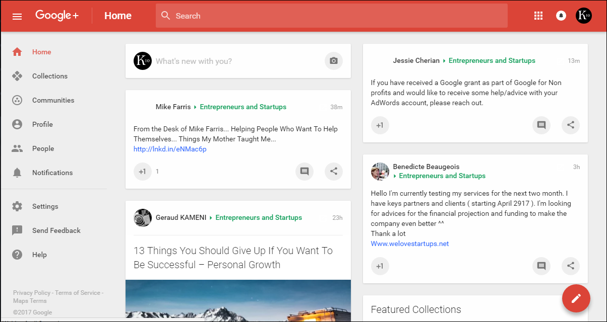
Tips For Using Cards Layout
- Ensure that the whole card is clickable, rather than just a small portion or link.
- When selecting images keep different screen sizes in mind
- Try to keep it simple as cards only work best when they are not too complex; best with a basic typography and minimal description.
Grids
Like Cards, there is another design pattern called Grids that is popular among content heavy websites. However, unlike Cards, the information shared using Grids highlights the most crucial details identically. This makes browsing seamless and offers better options for styling. Web sites like YouTube and Etsy use this pattern offering a straight-laced feeling.
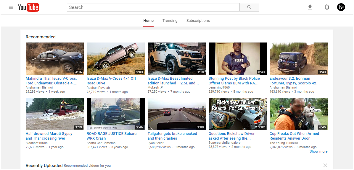
Tips for using Grids layout
- While using grids always keep white spaces in mind as that would ensure that each item looks presentable.
- Keep the layout consistent and the size of grids identical
- A standard practice is to use a 12-column grid layout for simplicity
Magazine
This design pattern has been prominently used across blog based websites and online news portals. It is useful for those websites that have regularly updated content across several verticals. It not only makes the website intuitive but also breaks the monotony of the website while showing a variety of content. Websites like Wired and Time use this design pattern across their domain.
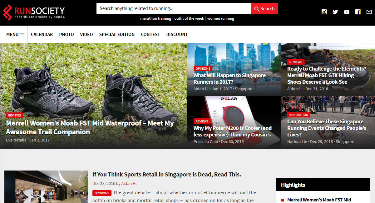
Tips for using Magazine layout
- Emphasize on images as it is the core of this layout
- Sublet your content into different sections and follow same design across them.
- Have either a horizontal or vertical menu
Redesign your website as per latest design trends
Container-free
Minimalism came out as a buzzword in web design arena last year. As Apple and Google took the approach towards flat design, most of the websites also ushered in the same strategy while presenting information on their website. The container-free pattern takes that approach to a whole new level, stripping away all the unnecessary illustrations. Up till now, most of the web design have been based on linear and structured layouts, but we are gradually moving away from it, by thinking out of the box. This is a good approach to ensure that the website design does not get boring.

Designing a website without containers puts all the focus on the content and visual hierarchy. Apple and Google both have used this pattern to highlight their product lineups. Even Ablysoft has used this approach in their latest redesign.
Tips for using Container-free layout
- Focus on typography and use it accordingly to divide different sections
- Use contrasting colors to make it easy to differentiate between sections
- Keep the content short and precise. Ensure that your images are able to entice visitors
Single-page Web Apps
As website designing has evolved, it has brought web applications to the center stage. Rather than having a multipage navigation system, users nowadays prefer a single page site better known as web apps. Such designs use AJAX to load content asynchronously while combining multiple actions on a single page. Other than web applications, such pattern is also popular among websites where the homepage serves for different sections of the website. Gmail, Spotify, and Tumblr are some of the websites, which incorporate this design pattern.
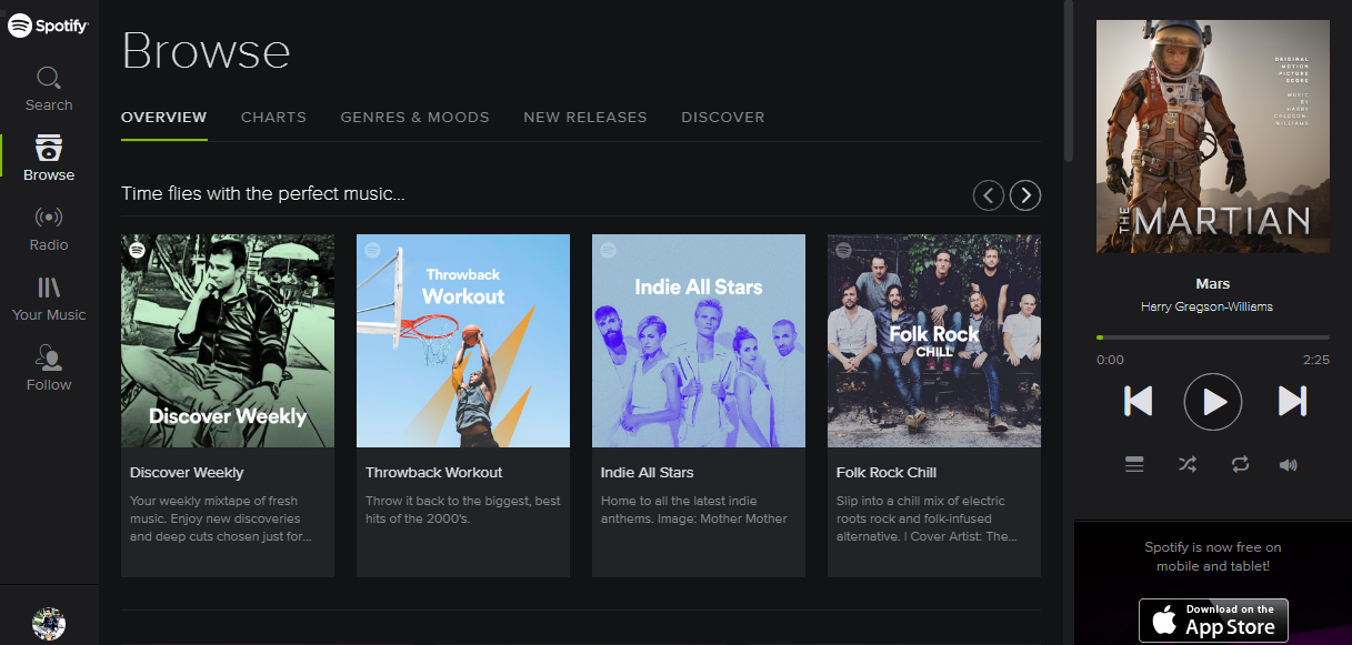
Tips for using Single page web apps layout
- Generate unique URLs for each viewpoint or section in order to ensure support for the back button.
- Sticky navigation is a must for single page web apps
- Apply smooth scrolling techniques to make the user experience less jittery.
F Pattern
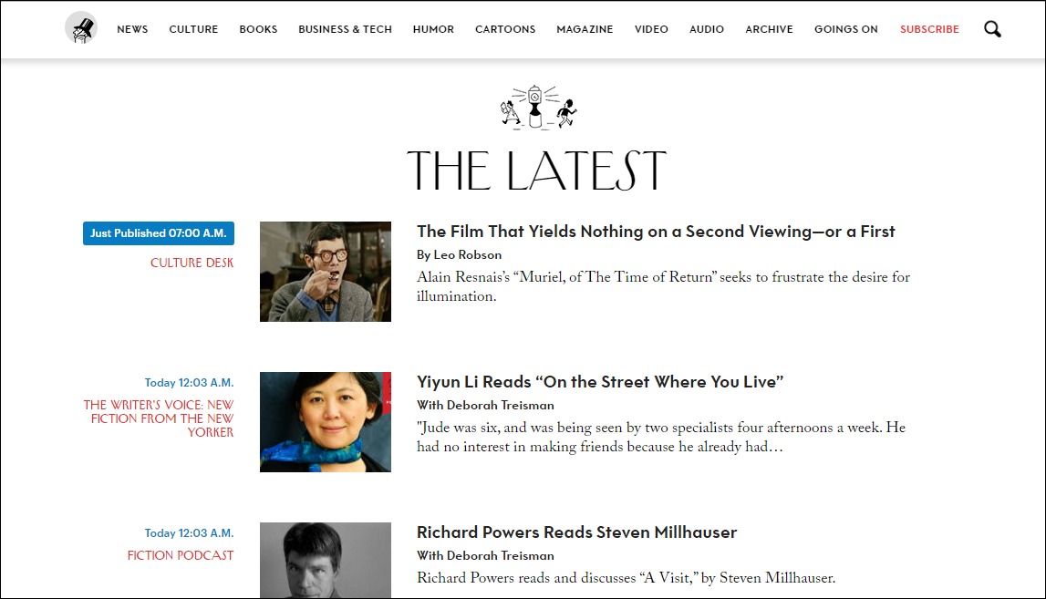
For a larger part of the last decade, websites especially text-heavy ones have used F pattern design. Studies show that putting a lot of text on the website results in positive response from users; they respond better if the website has an F pattern design. This is because our brains are hardwired to scan in F pattern.
By using this pattern, you can create a pathway for the user’s eyes to go where they tend to go normally. This also gives designers room to highlight content they want users to emphasize upon, and in turn impacts conversions to a great extent. Web sites like The New Yorker and other prominent ecommerce businesses use this design pattern on their websites.
Tips for using F-Pattern layout
- Keep all the CTAs on either left or right side of the page to ensure that users either start reading with a CTA or end reading with a CTA.
- Start each section with a catchy phrase
- Use right side column for relevant but lesser important stuff as it falls outside scanning area.
Also Read: 9 Homepage Design Practices to Improve Usability and UX
Z Pattern
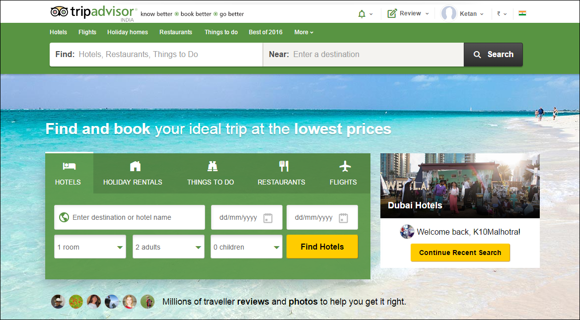
Other than F pattern, our brains also respond well to the Z pattern. In fact this design pattern is highly effective when it comes to incorporating CTAs (call to action) into the website. Most business websites nowadays use this pattern effectively, as this design pattern is better suited for websites with singular goals involving less content.
When you want to direct users to specific points on the website, eventually enticing them into taking an action then Z pattern is the best choice.
TripAdvisor, McDonald’s, KFC etc. all use this design pattern across their websites.
Tips for using Z-Pattern Layout
- Place the CTAs at the right side or along the end of a line, as users tend to pause before moving to next line giving you time to entice them.
- For the most crucial CTAs, use the upper right corner
- Repeat the pattern multiple times on a single page; it will help users get accustomed to the pattern.
Asymmetry
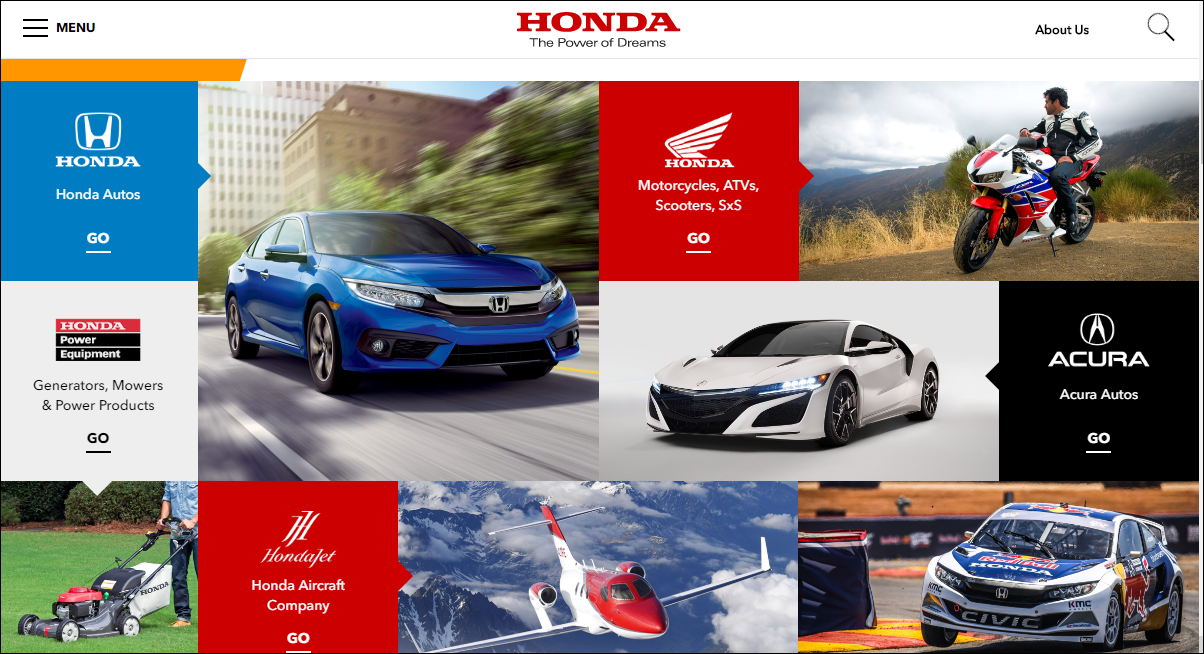
There are more than a billion active websites, and this has made it imperative for designers to think outside the box. In order to ensure that specific content stands out on the website, designers have started to use an asymmetric design pattern. This design pattern allows the website to appear less plain and more energetic. However, one has to be very careful in implementing this style as misplaced asymmetry can often lead to confusion and can distract the user. Some of the great examples of websites that use asymmetric design patterns include Honda and Esquire.
Tips for using asymmetric layout
- Use distinctive colors to break symmetry ensuring that those sections pop out.
- Text alignment is crucial in this layout therefore always keep it left aligned.
- Try different shapes like diamond, a triangle with sharp images rather than square or circle to add more visual weight.
Over the years, we have come across several intuitive website designs, which have stretched our imagination. However, innovative they, some patterns are timeless and have the capability to stand the test of time. The above-mentioned design layouts have been in practice for a long time and will continue to be in the long run.
Discuss Your Web Design Requirements With Experts Before Zeroing in On A Design Style
Consult FATbit
The bottom line is that design is just a manner in which you present content or information. However, the information will have more effect if it is presented in a more intuitive way.


Comments (2)
 Daniel
 FATbit Chef Post author
Hi, Thanks for sharing these article about web designing. Reading this article gave me many things to think about.
We are glad you liked it. keep visiting us for more such posts
Cheers!
FATbit Team