The ultimate goal of every website is to expand business by boosting conversion rate – whether it is of sales, registrations, shares, or just clicks. And since ‘Good User Experience = More Conversions’, it makes obvious sense that web designing is more about delivering a rich user experience rather than just creating pretty pages.
A website’s overall user experience primarily depends on three factors – usability, functionality, and readability (or visibility). Website functionality is something that developers need to take care of but as far as delivering usability is concerned, designers play a major role.
Following are easy to implement web design practices that not only improve a website’s user experience but prove magical in boosting conversion rate too:
Minimize the loading time
More than shiny layouts & glittering icons, visitors want faster access to your website. But the notion of making things look good is so natural, continual, and unintentional to us that in most cases we end up using heavy graphics and compromise on website’s accessibility – which eventually leads to poor user experience and makes visitors want to leave your website. Here is a personal experience:
Recently, I came across this extremely creative Swiss airlines website www.world-of-swiss.com (a one page HTML website). Naturally, I went on to show it to my web design team, but it took so long to load (even at a pretty good internet speed) that there was enough time for us to exchange a few awkward looks.

You can see in the above animation the extremes of creativity involved in building this website. The website is too slow due to the use of heavy JS and large images. It drove me up the wall while I waited for the page to load; apparently as a user I wouldn’t use it despite how much I like it.
However, it does not always mean that you have to compromise on the aesthetics in order to minimize the loading time. There are certain practices such as optimizing images, using HTML5 form validation, including fewer classes and emphasizing on class reusability, which can reduce the loading time considerably while keeping the look and feel of your website intact.
And of course, eliminating unnecessary graphics will also help.
Is Tedious Loading Time Driving the Traffic away from your Website?
Fix it with Experts’ help
Choose the right color scheme

A web design usually goes through a series of experiments before final color scheme is selected. While a little bit of experimentation is essential for anything to evolve, especially designing, too much of it can also kill the user experience.
Traditionally, things were simple – black text on white background would do as it offered best readability. Soon, colored backgrounds began to trend, followed by images & video backgrounds. However, amid this evolution, website’s readability got compromised a bit.
There is no hard and fast rule to which color arrangement you should choose, but preferably, it should be dark text on light background or vice versa. Using right contrast is also a key to offer better visibility to your text. You can take help in this regard from this concise study on color contrast.
Another point to keep in mind is keeping the similar color scheme throughout the website instead of switching from one color scheme to another. It may seem fun to add different color schemes, but it will quickly tire readers’ eye and certainly affect your website’s average user stay time. Try the following animation in full screen, and you will notice the impact.
Quick Suggestion: Besides text color, you should also pay attention to font type, size, & weight to improve the visibility further.
Make the navigation intuitive

Poor navigation is one of the top reasons for higher bounce rate. If a user is not able to easily figure out what to do next after landing on your website, you are most likely to lose him right then, and it can happen at any point.
Here, instead of spoon-feeding you with tips like make categories-subcategories, label them properly, make them clickable, etc., I would suggest you to take assistance of marketing experts for creating website structure. Reason being, website structure should be along the lines of customer behavior, in which marketing experts are through and through.
It is crucial to take care of the website structure in the beginning itself, since things can get too cumbersome to amend at a later stage. Besides, re-editing code is a bitter pill to swallow for any designer/developer.
Improve your Website’s Structure based on Customer Behavior Analysis done by Experts
Talk to FATbit’s expert
Building an optimum website structure that follows design convention makes your website intuitively navigable, as users already have a fair idea about how to proceed. Experimenting with the placement of navigation tabs & visibility may seem fun, but it will give every new user a hard time to understand and get familiar with your website. And of course, its impact will reflect on the conversion.
You can clearly see in the image below, which website’s landing page has a better conversion prospect.

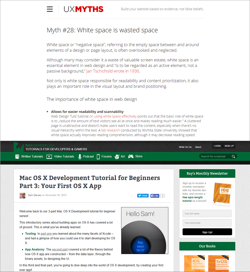
Implementing breadcrumbs is another way to offer better site navigation. Here again, it is important to follow the design convention and place breadcrumbs at the top of the page. Why I am emphasizing on it is because recently I found that CoachUp.com has its breadcrumbs at the bottom of its pages, which is almost as bad as not having them at all.
Mind the white space

Effective use of white space is an essential web design practice. As prominent designer Ellen Lupton points out in her bestselling book Thinking with Type that ‘design is as much an act of spacing as an act of marking’.
Making things compact is our natural instinct, which quite often leads many designers to consider white space as the waste of space. However, designing a website is not about playing Tetris or arranging newspaper stories, in which you need to fill every bit of empty space.
Information on websites is consumed in a very different manner than newspapers. On websites, priority is given to better reading experience, which can only be delivered through adequate spacing between elements. Smart use of white space also enhances the visibility of components, which eventually allows users to focus on them. Besides, it also adds a touch of elegance and sophistication to your website.
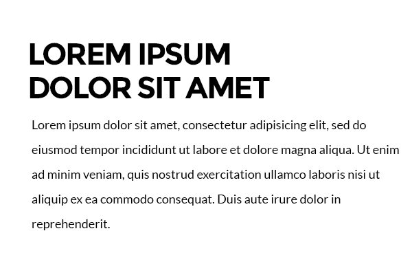
Compare these two random webpages featured in the picture below, and you will easily see which one lets you focus on elements more, seems more elegant, and why.
Note: The purpose of above picture is only to demonstrate the role of white space in web designing, not to criticize any website’s designing approach (which may be more a more mindful one depending on its business goal).
Arrange the components properly

A well-aligned and symmetric visual design is crucial to provide your website a professional look and offer usability. Therefore, a keen eye on proper arrangement of components is essential from the beginning.
Most part of the component arrangement takes place at the wire-framing stage and it is important that all the margins, padding, borders, and gutters are clearly defined during this stage. Otherwise, making small adjustments in HTML code can take forever. Add responsive behavior, and results will manifold automatically. Besides, responsive web design comes with its own challenges such as font size, block size, and spacing issues.
Looking for reliable web designers to make your website responsive?
Check our responsive design services
Element placement on a webpage is as much about conversion as it is about aesthetic. While proper alignment of elements gives your website a decent look, their arrangement affects its conversion potential.
Users don’t tend to read webpages from top to bottom. They jump off to the section that catches their eye first. For example, the pattern of how a user reads the following dummy webpage will look something like this:
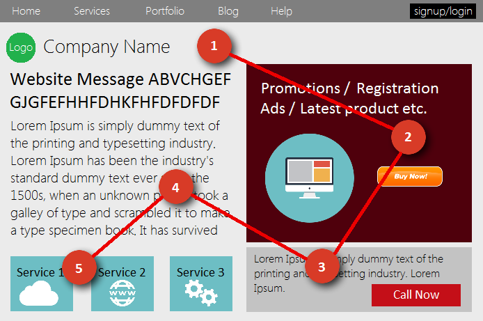
Hence user interaction is an important factor to consider while deciding which component should go where on a webpage. Here, you also need to play a little with color contrast in order to enhance the visibility of the key elements. Only then will you be able to make users do what you want them to do once they are on your website.
Test it for errors

After you have taken all the stringent measures and precautions required to deliver a rich user experience, then it’s time to ensure that your efforts don’t go in vain. Invest some time in testing its usability; gauge the factors like intuitiveness, efficiency, preciseness, fault tolerance, and interactivity.
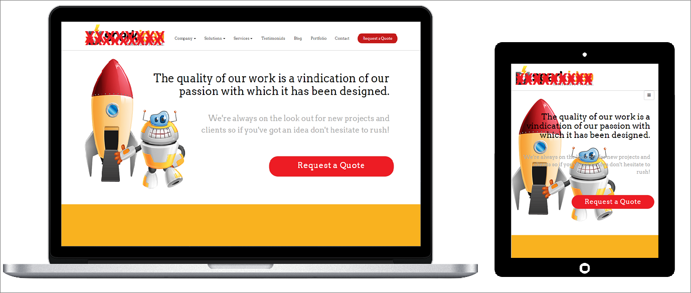
Floated elements, CSS Min-height bugs, layout misbehaving are some of the common issues that can arise at testing stage despite taking necessary precautions. Proactively check for them while you test your website. In responsive web design, layout inconsistency and text overlapping are also quite common. For example, see in the image below, how text overlaps in the mobile view for this website and screws up its looks completely.
All these issues must be resolved in order to ensure that you have delivered what you really wanted to.
Also Read: Testing Responsive Website – Major Challenges and Solutions
In web designing all little things combine together to leave a big overall impact that defines a website’s user experience and conversion potential. Following above-mentioned practices means you are implicitly taking care of every element on a website from every perspective –its aesthetics to its workability – which is the only way to build a great website design.
Multiply the impact of your website with correct design implementations
Let’s talk!