It’s easy to assume that the challenges facing a web designer are completely unique and novel. Despite being based on technology that is still relatively new in the grand scheme of things, web design nevertheless shares a lot of DNA with pre-existing forms of art and design.
For hundreds and thousands of years of human history, brilliant individuals have been developing tricks and techniques to make drawings, paintings, photography, graphic design and other forms of visual media beautiful or arresting – and arranging elements on a web page is as much an act of artistic composition as the creation of an oil painting.
Let’s look at some classic visual art techniques that have stood the test of time and consider their usefulness for web design…
Structural composition
One fundamental compositional technique that has been in use since at least the eighteenth century is known as the rule of thirds.
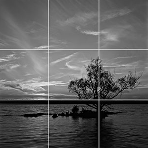
Image: Wikimedia/Moondigger, licensed under Creative Commons 2.5
The crux of the rule is that a great way of composing a compelling image is to divide it into thirds (both horizontally and vertically) and align the most important element(s) either along the lines themselves or at the points of intersection. In the example image above, the tree is located exactly at the lower-right intersection of lines, and the horizon is aligned with the line of the lowest horizontal third. This creates a composition that is deliberately asymmetrical and yet satisfying, with a kind of “well-balanced tension” or dynamic appeal.
Of course, a website isn’t exactly the same as a painting or photograph, because the user can scroll – but this is a great rule of thumb to consider for the above-the-fold portion of the layout, especially that which might include a hero image and some key floating elements.
Greeting the website’s visitors with a striking, beautiful composition when they first arrive is a great way to impress them with your client’s style and professionalism – and you can ensure that key elements such as logos and call-to-action buttons are placed in compositionally strong areas where users will notice and respond to them.
Another aspect of good composition is to not start with too many competing elements and to try to arrange only those few elements that are key to the communication of the idea.
“Composition is the art of arranging in a decorative manner the various elements which the painter uses to express his sentiments,” the artist Henri Matisse once said. “In a picture, every separate part will be visible and… everything which has no utility in the picture is for that reason harmful.”
Colour theory
Classic color theory is as relevant for web design as it is for any other visual media. Pairing colors that complement one another, “pop” vibrantly or evoke specific emotions is a vital skill for any designer.
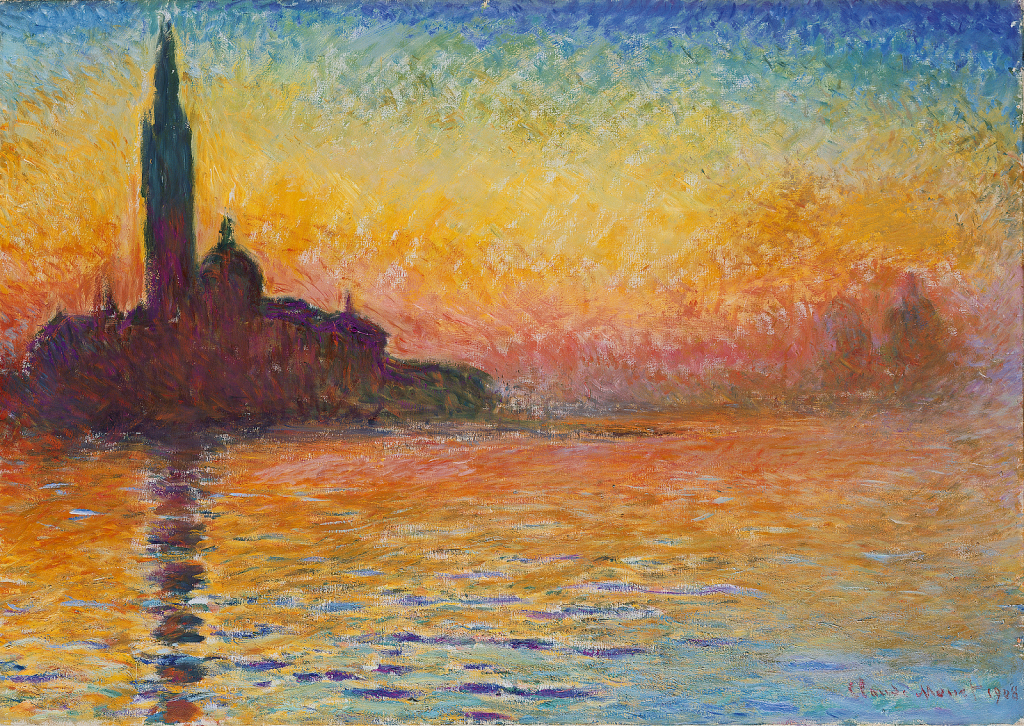
Claude Monet, Sunset in Venice, 1908
Image: Public Domain
One essential color theory idea is the concept of complementary colors. The above painting by Monet seems vibrantly colorful because it juxtaposes cool blue with warm orange – colors which are technical opposites.
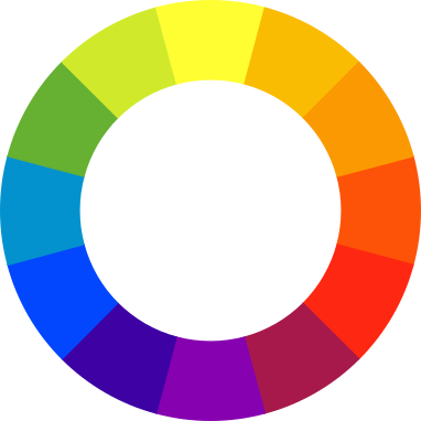
Complementary colors are easily selected by picking those that directly oppose each other on a color wheel. So, blue complements orange, green complements red, yellow compliments purple, and so on.
Complementary colors paired in any composition will seem to “pop” vibrantly, which can be very useful for web designers looking for the perfect color for a call-to-action button or any other important element. Designers should be careful not to over-use this technique, however, and should be aware that over-saturated and overdone color pairings can sometimes seem garish.
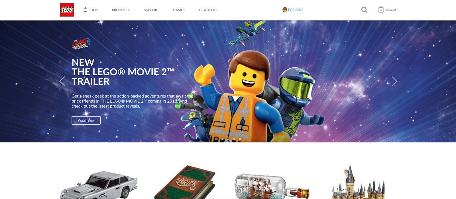
The hero image on this Lego website pairs a yellow-orange Lego character with a purple-blue background, for a vibrant color effect.
While complementary colors are excellent for projects that require vibrant colors, others may require more muted combinations. Another color theory approach is analogous colors, which are those that are clustered closely together on the color wheel and provide a more harmonious blend of hues when used together.
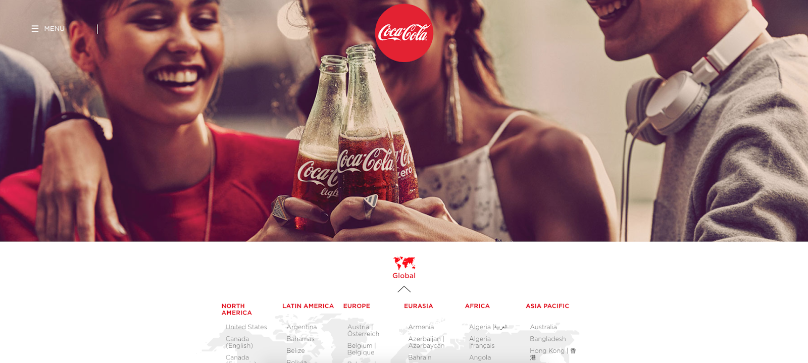
The imagery on Coca-Cola’s website predominantly features analogous shades of red through to dark purple.
Colour association, too, is an important part of any design. The Russian painter Wassily Kandinsky once said, “Color provokes a psychic vibration. Color hides a power still unknown but real, which acts on every part of the human body.”
The psychology of color association is probably too broad a subject to be covered in this post and is a fascinating topic in and of itself. However, it is worth considering at least in general terms, as the color choices you make should ideally reflect the “mood” you would like to convey to your visitors. If the vibe of your client’s business could be expressed as a color, would it be warm or cool? Light or dark? Saturated or muted?
There are plenty of sources online attempting to ascribe specific moods or associations to colours (i.e., purple equalling wisdom, luxury and creativity, whilst brown means earthiness, and so on). These can be useful for general guidance, although they should perhaps be taken with a pinch of salt; it’s seemingly quite rare for any two analyses to actually agree.
Colour association is also heavily influenced by the viewer’s cultural background in any case – for example, white generally means purity, clarity, and peace in the West, but is the color of death to the Chinese.
Leading lines and negative space

Image: Public domain
A “leading line” is a straight or slightly curved line in an artistic composition that serves to draw the viewer’s eye to an area of key interest – otherwise known as a focal point. In the above example, the viewer’s eye is first drawn to the large and comparatively dark shape of the nearby brick wall on the right-hand side and then travels along the length of the wall to reach the distant lighthouse.
 Jaguar’s website makes use of lines that draw the eye into the illuminated central space with the cars.
This technique can be used in web design to focus the viewer’s eye on a specific element, either by utilizing leading lines in the hero image or by employing interesting geometry in the page layout itself. This could be used to draw attention either to the imagery of the product itself or otherwise to a key element of the website such as an important textbox or action button.

The use of negative space in the composition can also be used to draw attention to an element in a dynamic way. Negative space is defined as the “dead space” around the subject of the image and can be used to make an element seem to be of critical, absolute importance. It is also sometimes used to create ingenious effects in text and logos.

The negative space between the ‘E’ and ‘x’ of ‘FedEx’ famously forms the shape of an arrow pointing to the right.
In conclusion, the most important takeaway might be this: there are many techniques and possibilities, and it’s always best to consider each project on its own merits and decide which approach will be the most appropriate for communicating the essential points. After all, in the words of Michelangelo, “A man paints with his brains and not with his hands.”
Having a broad understanding of traditional art and design techniques could be the key to putting your website designs on another level to your competitors. By learning the tricks of the old masters, you could produce websites that are not only modern and clean but are also classically beautiful works of art.