There are four psychological primary colors – red, blue, yellow and green. The psychological effect of these colors on us goes deeper than we think. While the blue color has a calming effect on us, black represent elegance and sense of exclusivity. Similarly, red denotes strength and yellow signifies joy and happiness. In the current age of competition, it has become highly crucial for online businesses to use these psychological effects to their benefits. The fact of the matter is that colors do aid in increasing the conversion rate of an online business. Let us take a closer look at it.
The 90-second rule for conversion
Once prospective customers reach your landing page, you have 90 seconds to convert them.
When you have so much less time to entice a user, it becomes paramount that you come out with all guns blazing. You need to put your best effort to ensure that the conversion rate of your website is high. And believe it or not, the colors you use on your website play a major role in it.
Do colors really have an effect on humans?
Why is that a brand associated with health or peace mostly chooses green as their primary color? Why is that a brand catering specifically to females use chic colors like pink or purple as their primary colors? Studies have shown that a color increases brand recognition by 80%. For example, if I ask, which brand comes to your mind when I say “RED”, your answer probably will be Coca-Cola. Likewise, if you ask any teenager, which brand comes to mind when they hear “GREEN”, their answer probably will be Spotify. Such is the effect of colors on humans. In addition to this, there are several other factors like:
- Color accounts for 85% of the reason why you purchased a specific product.
- Because we process images 60,000 times faster than text, colors play a persuasive physiological effect on our brains.
Ecommerce companies can also alter their sales by adopting a color that appeals to their targeted marketplace because:
- 52% of the shoppers do not return to a shopping website because they do not like the overall aesthetics of the website.
- 42% of the shoppers base their opinion of a website on the color and design alone.
Therefore, if the primary color used on your ecommerce store does not appeal to the visitor, there is a huge probability of that visitor not returning to your website.
Make Your Website Such Great That Nobody Wants To Leave It Midway
As discussed above, colors affect user’s emotion and by leveraging this you can easily draw their attention, hence increasing the conversion rate of the website itself. The bottom line is that color plays a major role in developing a perception of prospective customers about a specific brand.
So, the real question is how to make colors a high point of customer-experience and marketing ?
Also Read: 15 Tips to Design a Perfect Contact Form
How to decide which color your brand should choose?
When you are discussing with a website designer, the overall design of your website, the color is probably the last thing on your mind. However, the fact remains that it is probably the most powerful thing that can result in success and failure of your website. Moreover, you often tend to go for the colors, which appeal to you yourself. Have you ever done a research on your target audience, trying to find which color will help your online business the most?
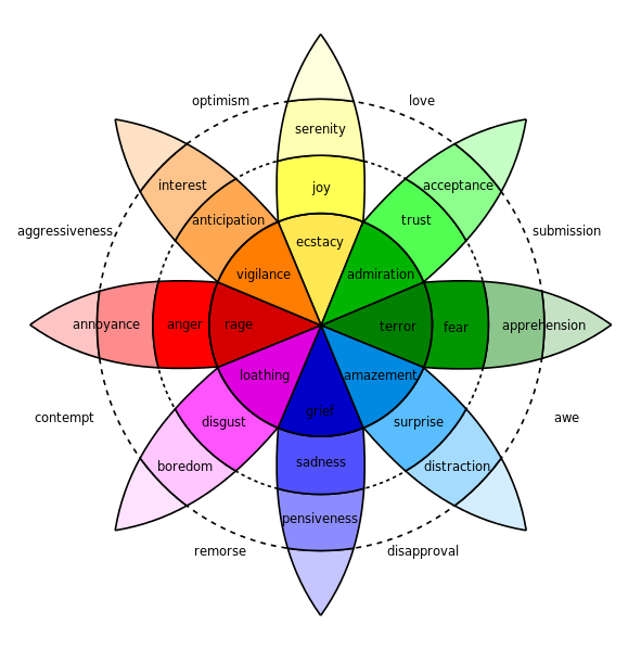
The above image is better known as Robert Plutchik’s famous “wheel of emotions”. It illustrates how variant shades of some colors correspond to variant emotional states. It is often used as a benchmark for determining which color would be best suited for a website. Tools like color-wheel of Canva can also be used to find out what colors go well together and generate the perfect color schemes for your website. In addition to that, you should also do a market analysis of which color properly denotes your sector. For example, if you are in food tech then it is best you choose a shade of red.
Where Should You Use Color?
Mere understanding, which color theme your website should adopt will not suffice. One has to analyze and use colors systematically to ensure optimal results. This brings us to the next big question; why should you use the colors. As we are talking about the color scheme of a website, we need to take cognizance of several aspects like hero graphics, headline, borders, backgrounds, buttons, and popups.
The 60-30-10 rule of Colors
Proper use of colors focuses on four crucial principals, the right way, right time, right audience and right purpose. So to create the best impact, use a combination of three colors and apply 60-30-10 rule.
- The primary color should cover about 60 percent of the total space and encompass a unifying theme of the design.
- You should use 30% of the space with secondary color to create some contrast.
- Finally, the 10 percent of the space should be used by accent color to provide the final touch of elegance.
Useful color tips to increase conversion rate
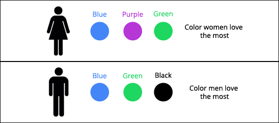
- Use colors based on gender specifics – If you cater primarily to a specific gender base, it helps if you pick colors that are liked by that particular gender. Studies have shown that women generally like blue, purple and green color while men prefer blue, green and black.
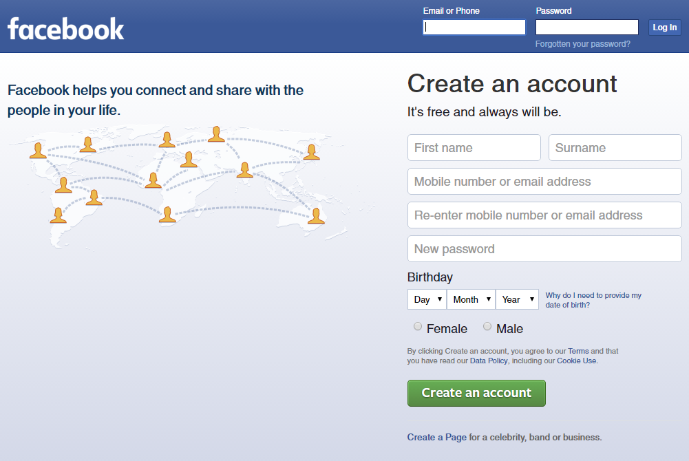
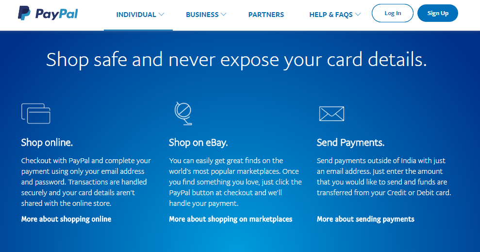
- Use blue color to garner trust – Blue is a color that most people associate with trust, peace, and loyalty. This is why it is one of the most widely used colors among businesses. The biggest social network Facebook uses Blue and so does Twitter. Even PayPal whose whole business works around trust and security uses blue as a primary color.
Also Read: How Optimized Images Drive more Traffic, Sales & Rankings to Online Stores?
- Yellow for capturing user attention – Most of the people are ignorant of the fact that yellow color is mostly used for warnings. However, many brands think that it is a color of joy and happiness. As Yellow stimulates the brains excitement center, it is best to use it for garnering the attention of the user.
- Green is suitable for environmental products – This is a no-brainer. Most of the ecological companies use green as their primary color as it is a chromatic symbol of nature itself. Another aspect is that people generally tend to click on the green button more often than any other color. Therefore, it is advisable to use green on CTA buttons.
- Black color adds sense of exclusivity and luxury – According to color psychology, the darker the color more elegant and sophisticated it seems. This is why black is often stated as a timeless color. Most of the luxury brands use black as their primary color. Even Uber named its luxury cab service as Uber black.
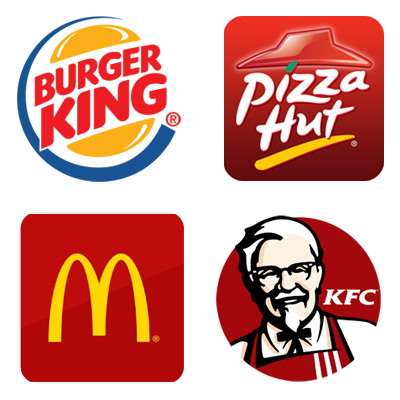
- Red color has a unique pull – Most food tech companies use the color red as it associates with hot and also makes you hungry. This is why big brands like KFC, McDonalds, Pizza Hut and Burger King use red in their logo.
- Avoid just using black and white – Black and white is a forgettable color combination. Therefore, if a website just has black text on white page, most probably readers will not remember it for long.
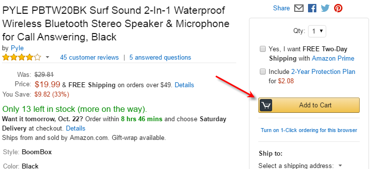
- Use bright colors for CTAs – Studies have shown that the highest converting colors correspond to Red, Green, Orange and Yellow. On the other hand, darker colors like Black, Dark gray and Brown have very low conversion rate. The biggest retailer in the world, “Amazon” uses Bright Yellow as “add to cart” button.
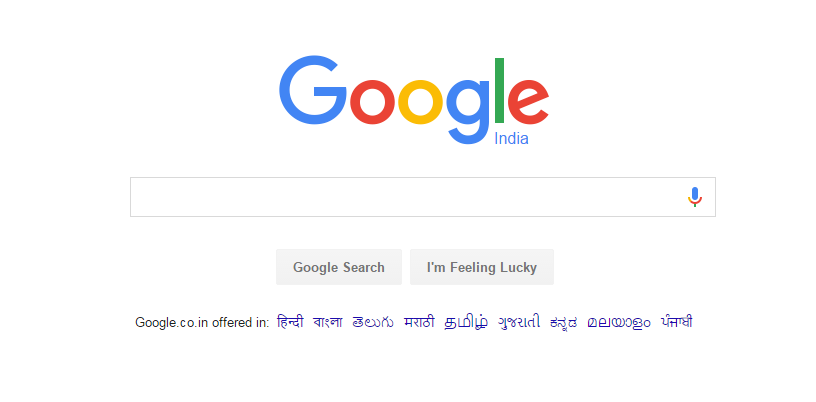
- Do not neglect white – While analyzing color psychology we fail to address one color which is most widely used in a website. White is one color used by every website. However, many color theorists do not count white as a color. Irrespective of that, one must use white space as a powerful design feature. One such example is the most popular website across the globe, “Google”. Nowadays many websites use plenty of white space to denote a sense of spaciousness and breathability.
Conclusion
There are colors all around us. When we say grass, the color that comes to our mind is green. The same is applicable vice versa too. Working on the same psychology, big brands, and online businesses have started to focus on colors in order to build a connection with their audience. This not only helps increase the trust factor but also results in better conversion rate.
An appealing and revenue generating website is the upshot of rigorous analysis and user focused design. If you are not able to generate expected revenue from it, chances are it lacks on both the fronts.
Discuss your issues of poor conversion rate, high bounce rate, cart abandonment, etc. with our experts

Comments (2)
 Richa Gangwani
 FATbit Chef Post author
Good one! Thank you for sharing this informative content. I found it helpful and interesting.
Thanks Richa for your appreciation.
Cheers