FATbit recently completed redesign of Notebudd, a peer-to-peer platform that allows students to share notes, study guides, past midterms/exams or any study materials. Through the platform, users can buy and sell study material just like an e-commerce website.
Notebudd approached FATbit to redesign its website and promote it as one-stop knowledge hub for students. Whilst core objective of Notebudd team was to increase user base through redesign, there was also a need improve user experience to make it a preferred destination for students.
Initial Research
To succeed in its objectives, the website required a seamless user experience for the end user. This was not possible without understanding what the brand stood for, who the target audience is, and what role the website would play for its users. It is vital to understand that the theme of the website should always be in conjunction with the products and services it provides as well as the targeted user base.
Suggested Strategy
Our findings during research phase helped us simplify the goals for Notebudd, and generated a set of recommendations for moving forward. These details would act as specifications, ensuring that all future design decisions were grounded in evidence-based research.
After various brainstorming sessions, our proficient analysts drafted mockups to give client an idea of our design vision. It was clear that homepage lacked substance, and required complete overhaul. Our team of information architects also felt the need of restructuring navigation to make information easily accessible.
We shared our observations with Notebudd team in an interactive session and explained our ideas, prototypes, and also got approval for our proposed approach.
Design Implementation
After detailed analysis and information gathering, we moved on to the process of active re-design.
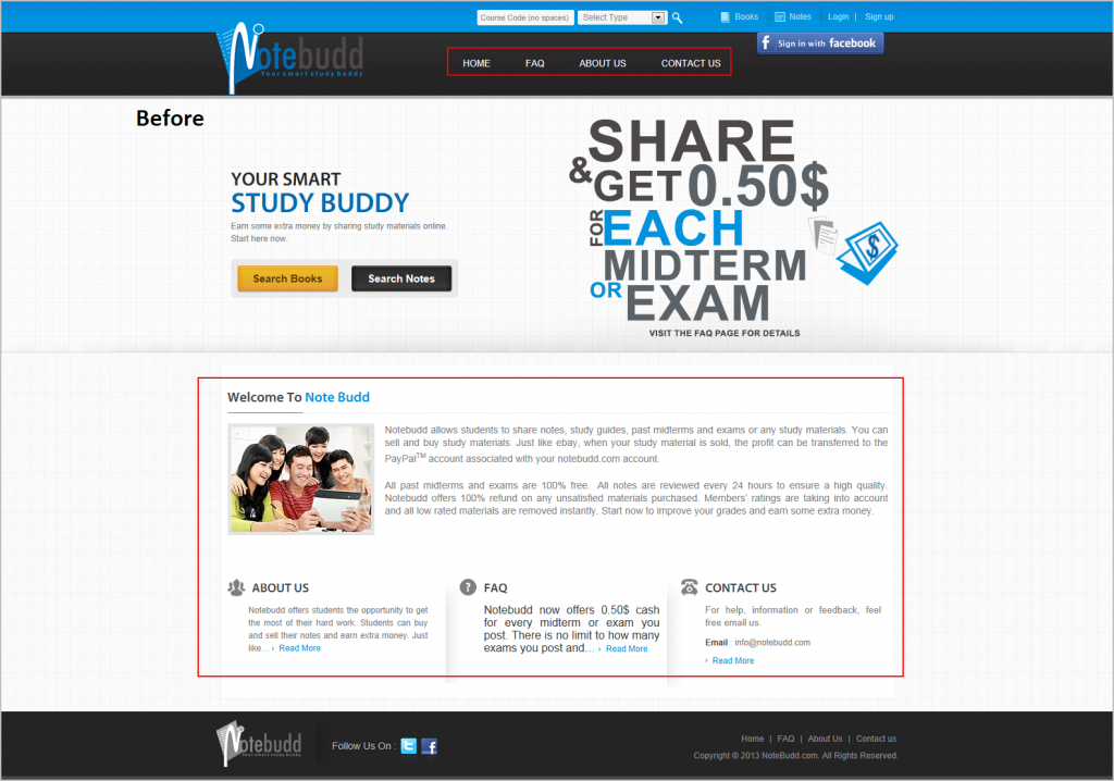
Homepage (before)
 Click to Enlarge
Homepage is clearly website’s backbone, and needs undivided attention. This is why we focused on a feature rich homepage with all the relevant information.
- Color palette of the website consisted of gray and light blue.
- There was not much information available to the user on homepage.
- The homepage banner did not add much value to the website.
- The menu bar also lacked any substance.
- Design of the footer could also use links to relevant pages and visual upgrade.
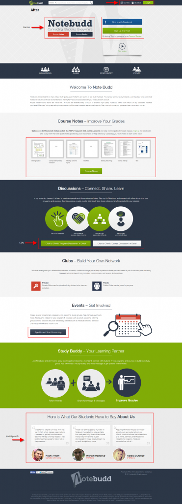
Homepage (after)
 Click to Enlarge
- The overall color palette was changed to mint green and gray.
- Because website is majorly about sharing books and notes, we highlighted the same in the banner.
- Rather than multiple lengthy content pages, all the content from those pages was rearranged and merged into the homepage. This was an innovative approach as it diminished the need for a menu bar as well as separate pages.
- CTAs were added to each section for user engagement.
- Testimonials entice visitors into trusting the service. This is why we incorporated a dedicated testimonial section on the homepage.
- Footer was redesigned to look livelier with more prominently placed logo.
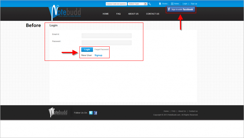
Login (before)
 Click to Enlarge
The login page was simple, and was not capturing user’s interest. Although one-click Facebook login was present, its placement in the header was not ideal. Login/signup options did not stand out from the rest of the website.
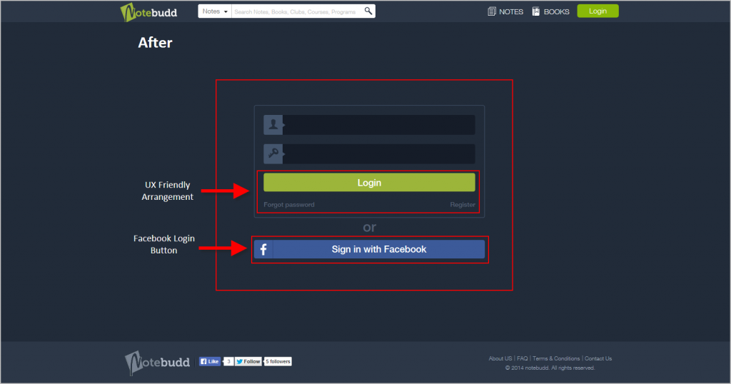
Login (after)
 Click to Enlarge
We wanted to ensure that only relevant information is visible to a user on the screen at any given time. In order to make the login/signup page stand out from the rest of the website, its color palette was changed to a darker theme. One-click login via Facebook was placed below the login box.
Dashboard (before)
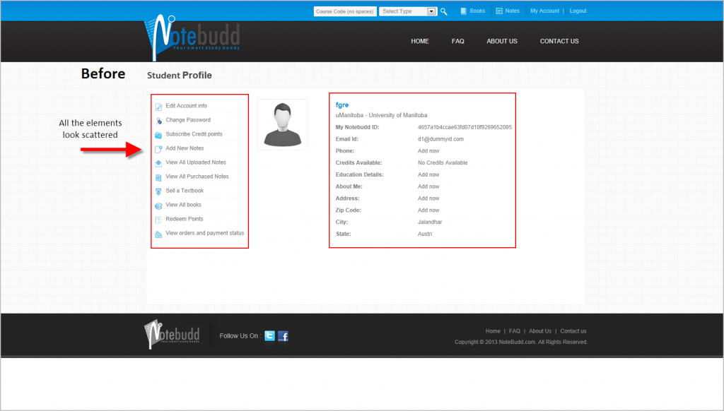 Click to Enlarge
After detailed website analysis, we found that registered users spent majority of their time in dashboard. UI of Notebudd’s dashboard however needed rethought. It had a static design with little or no interaction with the user. The tabbed approach made it look more like a settings page.
Dashboard (after)
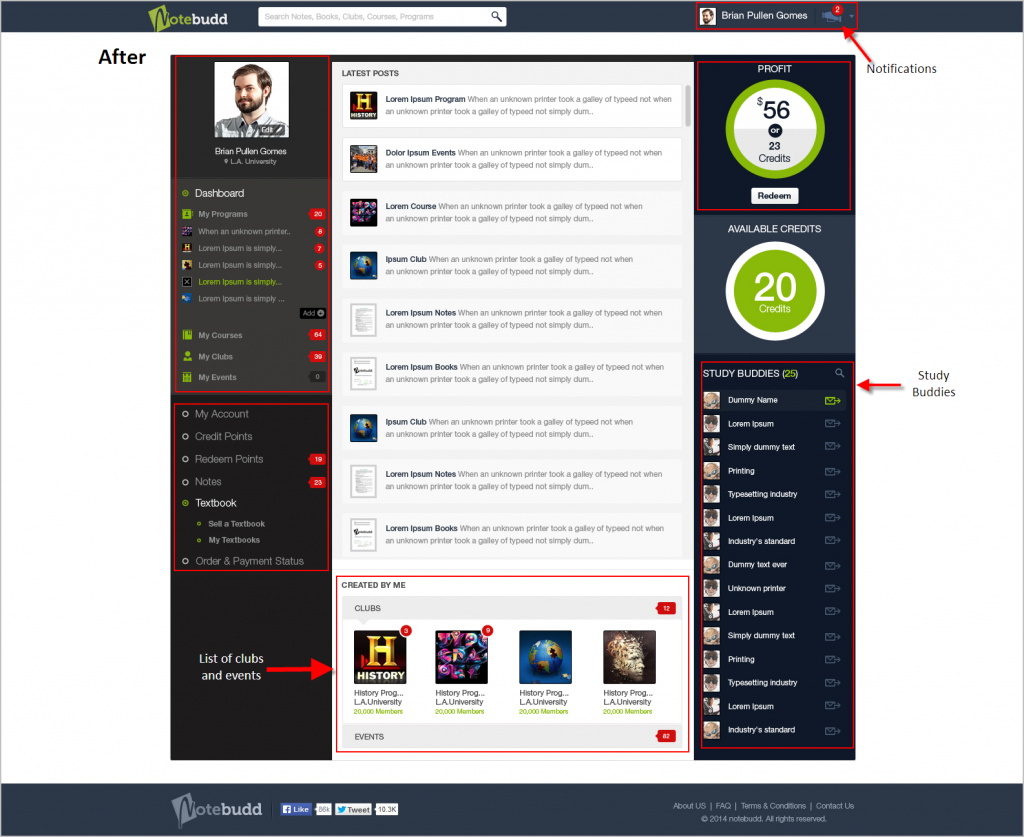 Click to Enlarge
We pitched the idea to transform the dashboard into a continuous page of live updates and feed. This not only increased the interaction level but also created a peer-to-peer channel. Relevant information essential for the user was placed directly on the dashboard, diminishing the need for opening separate sections. Badges were also added to the interface to keep the user updated with new updates and notifications.
Other features that were added are:
- List of associated programs, courses, clubs, and events.
- Feature to add any course at any time from his follow list to the timeline.
- Detailed user profile including year of graduation and all notes posted by user.
- On the side of the dashboard, a control panel was added for “My Courses, My program, My Events, My Clubs”.
- Users can also add/delete or view the main pages of each group from the control panel.
- If there is any activity, a notification is shown to the user near that course code or program name. The same goes for clubs and events.
Note listing (before)
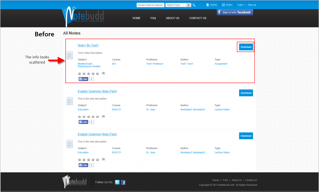 Click to Enlarge
Note listing is one of the most complex pages from design perspective. FATbit designers incorporated an innovative design approach to handle it. Earlier this page just had minimal interface with basic information. The sole purpose of this page was to present users with a download option with no real information sharing.
Note Listing (after)
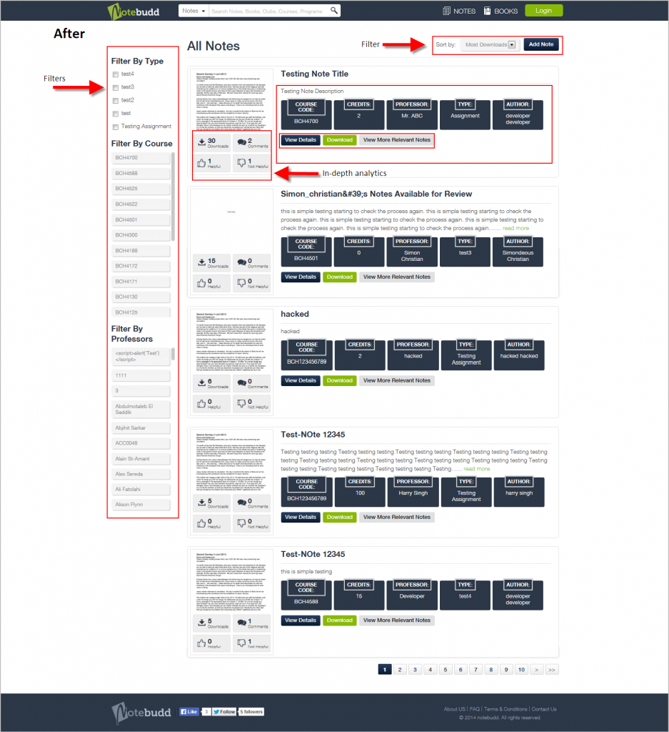 Click to Enlarge
- While designing this page, we went all out and adding a host of features.
- Advanced filters were added and placed in the left pane in order to streamline results as per relevancy.
- Users were also given an option to sort the results as per their preference.
We put a lot of emphasis on the user interface of this page in order to make it intuitive. Rather than just adding an option to download a note, we provided with in-depth analytics related to a particular note. This included number of downloads, the number of comments, how many found the note helpful.
Notes details (before)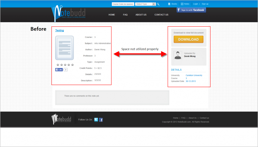 Click to Enlarge
The situation was same with the notes page when it came to user interface. There was very little information present and the page didn’t garner any interest. Screen real estate was also not wisely used.
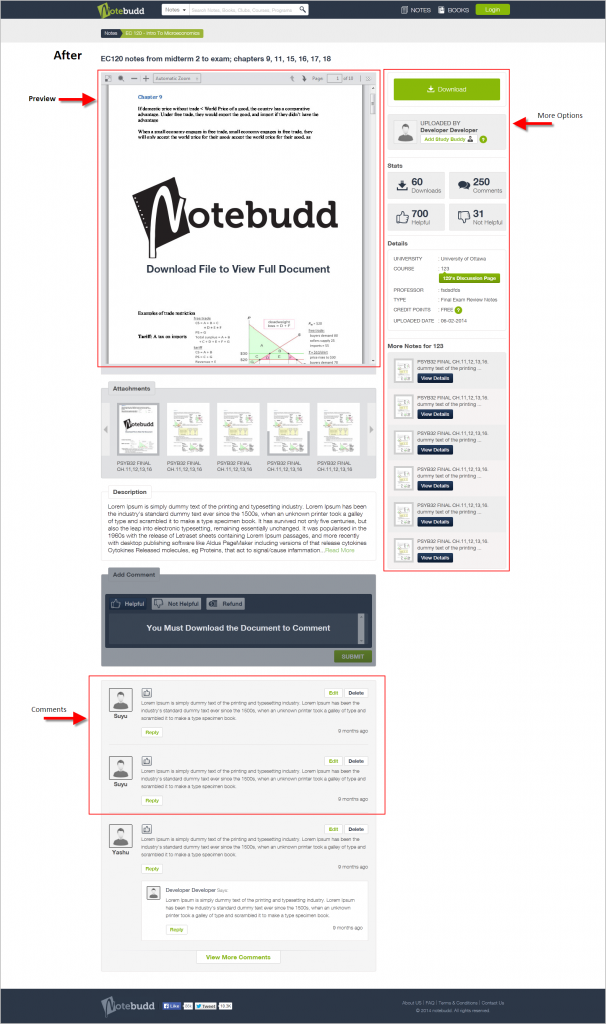
Notes details (after)
 Click to Enlarge
Our designers proposed the idea of giving a preview of the note to the users within the page. This would inform visitors about the note contents.
- The design of comments section was also changed, making it easier for users to segregate each comment.
- Different sections were added to the right pane like downloads, uploader description, statistics, and more notes for the uploader.
Post-release analytics showed that this approach drastically brought down bounce rate of the webpage.
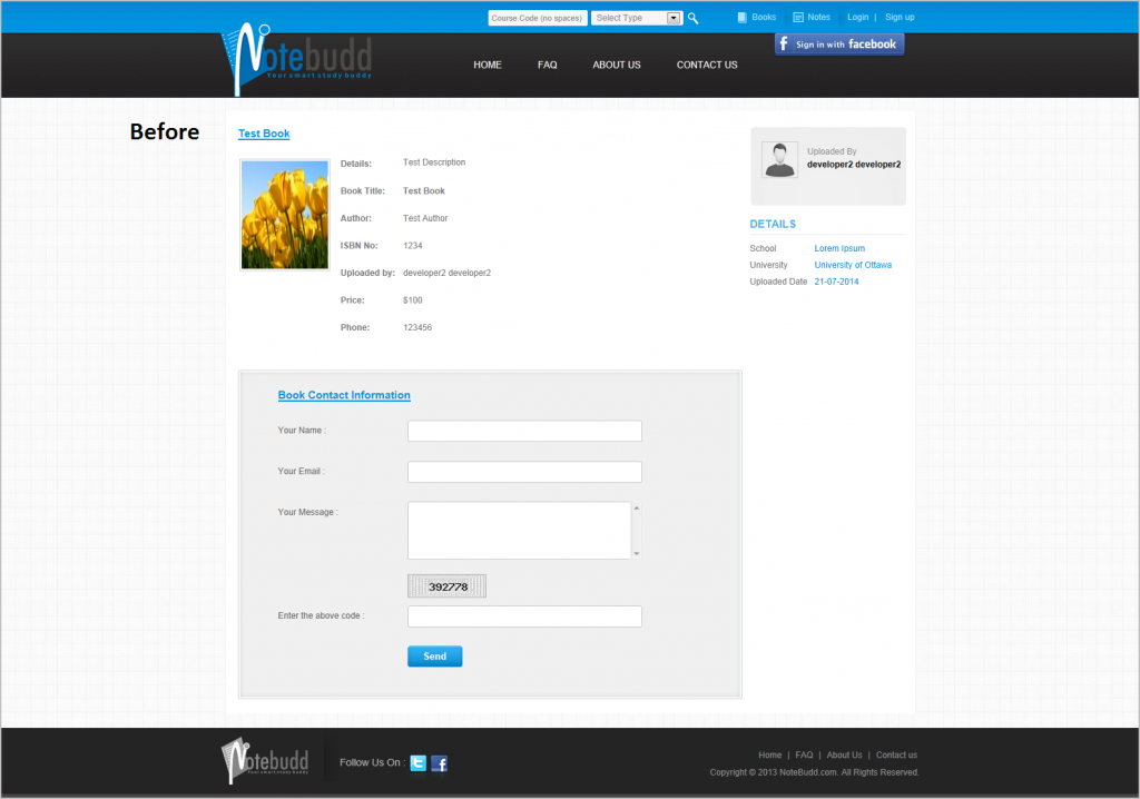
Books details page (before)
 Click to Enlarge
Another area where we found major scope of improvement was inner book details page. There were only three sections on this webpage: book details, uploader details, and query form. After working on different design implementation, we came up with a new interface that changes the whole outlook of this page.
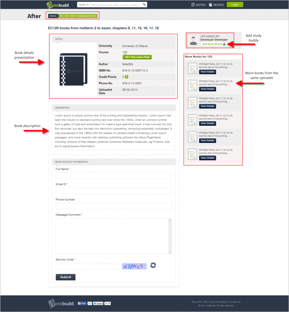
Books details Page (after)
 Click to Enlarge
- Breadcrumbs were added to the top section.
- Book’s image and details section were aligned in a way to give it a card like interface.
- A description section was added that would make it easy for the user to understand the contents of the book
- Add buddy button was added to make it easy user to connect with each other.
- A new section was added below it that showcased other books by the uploader.
In addition to the above-mentioned changes, our team of designers and developers also integrated some additional features to the website. The main aim of these enhancements was to create an active community and ecosystem of information sharing.
Events
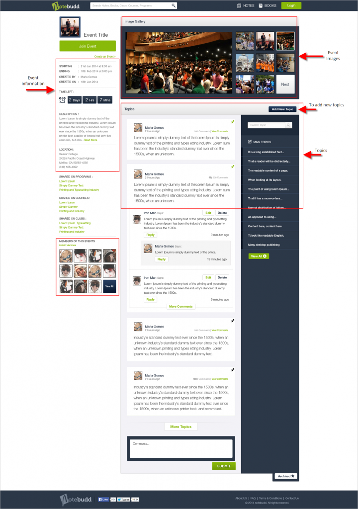 Click to Enlarge
The website was the preferred destination for students to share notes, study guides, and study materials but we added another dimension to it. We added a new section where students can create events which could be beneficial for other users. This not only added another channel where students could interact with each other but also lead to rich information sharing.
While designing this page, special care was given to the interaction aspect.
- The left pane houses all the technical details about the event like time left, description, location of event, and number of members attending.
- An image gallery was added to the top which showcased all the relevant pictures of the event.
- Below the image gallery, a topic timeline was added where a member could add various topics for discussion.
- The search option was provided to make it easy for the user to search a particular topic.
Programs discussion page
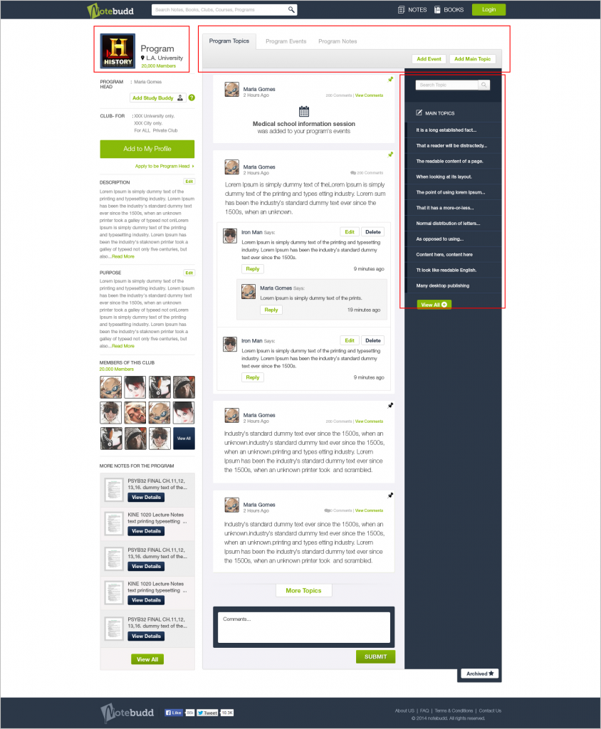 Click to Enlarge
FATbit researchers wanted to make Notebudd more than just a website to download books and notes. That’s why we added another section to the website where users could discuss program-related queries. The overall design was similar to the events page, but with additional tabs like houses program topics, program events, and program notes added to it. Users were also given option to add a topic or an event to the program.
Public user profile
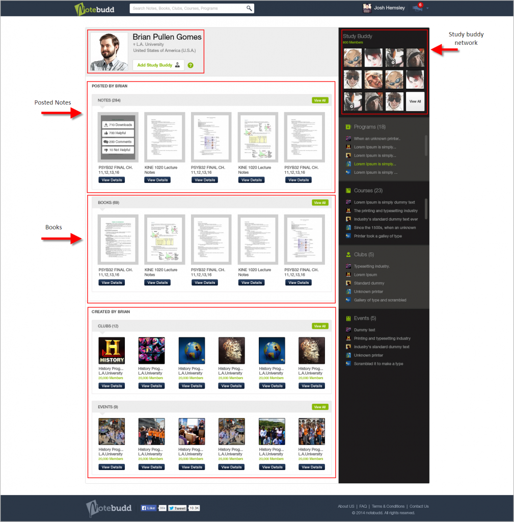 Click to Enlarge
Recommended Reading: How Much Do You Focus on User Experience Design While Building a Website?
Earlier Notebudd did not have any option to view a user’s profile. This made it difficult for users to interact with each other. From the start, we wanted to give a social outlook to the website, which is why we added a public user profile section. The design of this page was kept simple in order to accommodate user information.
- Each profile page has separate panels for notes, books, clubs and events added by the user.
- The right pane houses information like number of user’s study buddies as well as events, clubs, programs and courses joined.
The new Notebudd website has been launched with positive reviews. The site experience after the redesign beautifully reflects their brand and enhances the peer-to-peer services provided by the website. It not only provides an exceptional experience for users but has also resulted in rich engagement between students.
Initial post redesign metrics also look very promising when compared to pre-design stage data. With the improved navigation, UX focused design, and better content arrangement, new Notebudd has become a better communication and information sharing tool for the students.
Get your Website Redesigned by Professionals