Last Updated: 29th March,2022
Mobile applications are the new way of performing most of the activities online. A feature-rich and eye-catching mobile app UI design provides users with the experience they are looking for and boosts engagement. That is why the most crucial aspect of mobile app development is user interface design principles.
To make things easier, you can follow these points and design an excellent user interface for your mobile app.
Mobile User Interface Design Principles for 2022
Content-first Approach
Content is the first element that should be prioritized to make the app design focused on the user. Following this approach emphasizes one to think in terms of context, problem, and the user. Regardless of which methodology you plan to use, with the content-first approach, you are bound to create a unified voice.
Tips
- Use a visual approach to map the entire customer journey and keeping the larger picture in mind, use the content-first method.
- A lot depends on which methodology you plan to use to develop your product. It would help if you prioritized which features will be launched first.
Fullscreen Size Matters
A few years ago, 16:9 was the popular choice of mobile screen aspect ratios, with a physical button underneath. But that trend changed and mobiles these days have 20:9 aspect ratios with virtual buttons.
Mobile apps have to adapt to this changing trend, with the flexibility to further evolve as per changing trends.
Ideally, the app should make the best use of the screen real estate available.
When designing graphics for a fullscreen mobile app, do not follow the age-old rule “one graphic size for all devices.” Although it reduces the time spent on developing the app, it is bound to fail when your users are accessing your apps from multiple devices.
Tips
- Use visual hints and focus on micro-moments to guide the user to complete his journey.
- Understand the importance of accessibility and try to include a dark-mode with your mobile app.
No Clutter
Clarity is an essential characteristic of an excellent mobile app design. A cluttered user interface (UI) has never yielded favorable results. Elements like too many buttons or images, only complicate usability, and irritate your customers. Say no to clutter and keep the design inconspicuous for improved visibility.
Tips
- Use a minimalistic design approach to improve UI and only focus on maximum one or two actions on a single screen.
- Avoid random content, keep the text concise, create headlines, and use white space wisely.
First Impression
Just like a homepage provides the first impression of a website, an app’s icon is the first thing visitors notice about it. A mobile app UI design should be able to entice users to download it. App icons have proven to be a significant factor behind the failure or success of an app.
Tips
- Your mobile app will be competing against dozens, if not hundreds of other apps. We recommend using a unique symbol or shape as the app’s icon to make it instantly recognizable.
- It is a good idea to give your app a small and catchy name.
User-focused
One of the most critical mobile user interface design principles is empathizing with the user. It would help if you were well-versed with your target audience, have a clear understanding of their preferences, and create an app that caters to those preferences and also sets you apart from the competition.
Keep an account of all the demographic data through analytics. By empathizing with your customers, you can design an intuitive mobile app user interface that provides a solution to all of your customer’s pain points.
Tips
- Conducting a survey among your target audience might help you to understand the user’s expectations from the app design.
- While developing – integrating functionalities to solve customers’ pain points is a good idea. Moreover, always pay close attention to aesthetics.
Color Psychology
Add professionalism to your apps with subtle animations when transitioning between screens and pay close attention to the color schemes for your mobile app. Every color tells a different story and invokes a specific emotion. Pick those colors that align with your branding goals.
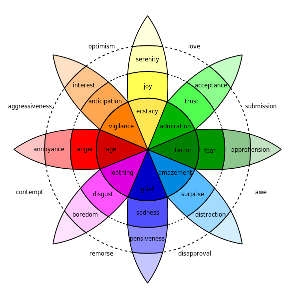 Robert Plutchik’s famous “wheel of emotions”
Tips
- Pick the color palette that matches your organization’s colors as your mobile app should look like an extension of your website.
- If the color of a button changes after a click, it signifies that a user action has been completed. Don’t forget to incorporate such subtle yet effective elements in the user interface (UI) of your mobile app.
High-resolution Images
Present day devices and faster internet connections can support high-resolution images. Deliver the perfect mobile app user experience with excellent imagery and boost engagement levels.
Tips
- Improve your app’s visibility on more substantial screens with high-resolution images.
- Using vector-based images is a good idea as they are useful and scale automatically with the screen resolution.
Best Mobile-app Design Examples
With the knowledge of some key parameters that lead to a pleasing UI for customers, let’s delve into apps that have got it right. Listed below, are examples of mobile – apps with a well-designed UI.
Starbucks
The coffeehouse chain is popular for its signature offerings that leave a lasting taste on the palette. Its mobile apps are equally immersive, and leave a lasting impression on the senses.
Black, brown, and green colors used in the app are in line with the brand signature and the value proposition the brand offers 一 coffees!
In terms of a design strategy, this works well, as the customer is reminded of what the brand has to offer.
Calm
A meditative and relaxation app, Calm has been awarded App of the year in 2017. What is special about this app, is the fact that the design stays true to the purpose of the app 一 to relax the senses.
Serene images of nature capture user attention, with the presence of very few buttons on the main screen. The color scheme is based on hues of blue, which further lends a sense of calmness to the user.
Houzz
Google pioneered the material design language back in 2014. Since then it has filtered down into popular usage by apps in the mobile industry. Houzz, an app that inspires users with home design and decoration ideas, is a prime example of material design theme.
The app won Google play’s app design award. The UI of the app allows users to consume a lot of information with minimum effort, setting an example of managing to deliver all necessary information 一 with clarity in design.
Textra SMS
“Simplicity is the ultimate innovation” – Steve Jobs
It’s easy to clutter but difficult to prioritize and present a clean UI to the user. Textra SMS aces, especially in this regard and offers a clean and clutter-free UI design. Another app based on Google’s material theme, the design of the app is equally suited to the professional as it is to a casual user.
Apple Store
Appropriate use of white space in the design lends an aura of sophistication and purpose to the mobile app. It gives clarity to the design, less cognitive load, which in turn lays emphasis on the elements present on the screen.
Apple aces the use of white space in its websites, mobile apps, and other designs.
The apple store is one of the primary examples of white-space best used in a mobile app.
Launch a Perfect Mobile App with an Intuitive UI & UX
Conclusion
The mobile app’s design is of secondary concern, and your primary focus should be on creating a structure that can add to the app’s credibility. Furthermore, keeping an eye out on the future of the mobile app market could be beneficial. The right combination of architecture and design will yield a user interface, and we strongly suggest that you get this part right.
The points above should be enough to kickstart your mobile app design process. These tips will help you create a mobile app UI design that resonates with user expectations and is high on the usability ladder. The mobile app market continues to boom. It is of paramount importance to learn the benefits of designing a mobile app user interface that puts across the message you are trying to deliver. I wish you the best for your next mobile app.