There is something about a clean web design that is very luring; non-designers often use the words ‘neat and simple’ to define it. Designing minds, on the other hand, use much complex vocabulary for explanation. It is a popular perception among non-designing fraternity that creating simple & clean designs doesn’t involve blood and sweat. This certainly is not true as clean designs can sometimes ask for a little more than any flash and animation laden website. So, let’s get a better clarity of creating a clean web design.
Before proceeding, let’s see why you need a neat website:
- A neat website is easier for a human eye to scan
- A website with a neat interface helps to maintain user’s maximum focus and reduce cognitive workload.
- Conversion rates and loading speed is way better in a clean website design
Getting the page layout right
This is something very consistent in most of the clean web design based websites. Scale and placement of the elements depends on the grid structure. It helps in maintaining neatness and order in the web page. Websites rich in content seem in chaos if there is not a solid layout structure at the place. Online newspapers and magazines require solid grid layout arrangement. When creating clean web design, professional website design company would always suggest to first pay attention to page layout structure and then focus on other critical elements.

Source – Medium
Typography needs attention
Typography is something that is equally important as layout structure. Using too many typefaces just creates a lot of disorder in the design. Every type attracts reader’s eye and this doesn’t work best for the website. For a clean and orderly look, designer has to work with only one or two typefaces. For emphasis and achieving other goals, size, color and case can be used in different degrees. Spacing too needs to be addressed to make sure that content attains high readability even if it is lengthy.
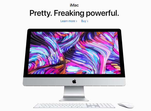
Source – Apple
Don’t make a rainbow
If you will spare the time to study some websites that boasts clean design, color depravity will be easy to notice. For some reason, web designers prefer to limit the use of colors when trying to attain a clean design. While gray is the all-time favorite, any other color can be used to highlight the most crucial elements. Perhaps, the problem with using too many colors is that it becomes difficult to emphasize on one particular element. If one works with one or two colors while keeping the base light, objectives like link highlighting and emphasis can be accomplished without any difficulty.
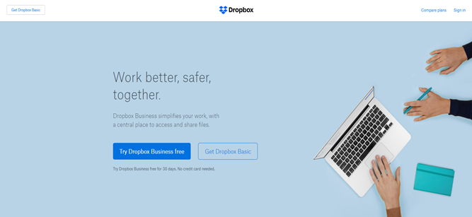
Source – Dropbox
Consistency in imagery
Imagery can set the mood of a website, and if it is not used with a sensible mind, it can spoil it too. For achieving clean design, the role of imagery is very crucial. Style of photography, illustrations and charts have to be consistent throughout the website. If there are discrepancies, then, website will miss the goal it is trying to achieve. Problems come up if one is running on a tight budget and there are no funds allocated for undertaking imagery related work but seasoned designers can manage by setting the tone right in terms of composition and depth of field. Offshore web design companies are good at this.
Clean navigation
Navigation is another crucial aspect of a clean and neat website design. A professional design will always tend to have intuitive navigation that guides the website visitor. In order to maintain a clean website design, navigation should be:
- Consistent – Consistency brings ease of access
- Distinctiveness – Mark multiple sections into different categories and subcategories
- Clickable Links – All the categories and subcategories should be clickable
- Mind the Menu and Footer – Always place the menu on the top and structure each section in it accordingly. Similarly consider placing other important elements like social media, FAQs, contact in the footer section.

Source – YouTube
In addition to a clean navigation bar the usability of the website is enhanced by locating a search bar in the top menu.
White Space
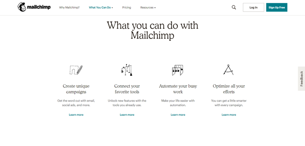
Source – Mailchimp
White space is another element that is abundant in clean web designs. So, make sure you don’t choke the website with unnecessary elements. White space is strategically used to force the user to focus on relevant information on the web page like Call To Actions (CTAs) and other different types of content.
Create a Professional Website that Reflects your Brand Image
Summing up, for creating a professional website, a minimalistic approach is the best way to express the brand’s message through the website design.