Are you having a hard time improving the conversion rate of your website? Is your landing page failing to make an impact on visitors and not sending enough users further into the sales funnel? Do you know that the main cause behind these undesired results is the ineffectiveness of your website’s CTAs?
Call to Action is undoubtedly the most important part of your website when it comes to driving traffic to sales funnel and increasing conversion rate. A well-planned & designed CTA seamlessly directs users to take actions, desirable for your business, which automatically results into a better conversion rate.
If you are using common text on your CTA buttons such as “Click here”, “Buy now” or “View more”, etc., then it is time to revise. A common, poorly placed, and boring CTA will not grab user’s attention. Such call to action practices contribute nothing or very little to your company.
Having strong & relevant CTAs on your website, which tell users what exactly they will get by performing a certain action, is the key for creating better engagement & improve conversion – whether it is signups, views, subscription, or sales.
Here in this article, we will uncover different factors that make a Call to Action work with examples, so that your business can bring out the most of its website.
1. Choose your words carefully
After introducing product or service, most online business owners want visitors to fill form, register or purchase directly. Your call to action, however, will achieve any of the mentioned goals only if planned with due diligence. Like mentioned before, a boring button saying ‘Click here’, ‘Learn more’ or ‘Submit’ is not going to help with your goals.
The first example you see here uses a reference to a past success story and urges the prospective customers to contact the company. Use of concrete numbers, case studies etc in the copy of your call to action garners trust and makes an effective ‘call’ asking immediate ‘action.’

Being a little creative in your call to action can also help in building a relationship with website visitors. If you take up a conversational tone like online fashion store ModCloth, it can easily take the visitor to the next step without you sounding pushy. Connecting with an experienced Call to Action optimization services provider can help in implementing these CTA strategies effectively.

2. Start your CTA with a verb
In the English language, we read from left to right, the verb and subjects in a sentence help us in quickly comprehending the meaning of the entire sentence. It is very important to acknowledge these facts when crafting your call to action. When a visitor reaches a website his attention is very elusive.
Your visitors are not going to take any action until you tell them to. They will randomly click here and there; read an entire blog post and not share it; read your product details and not buy unless you ASK them to do so. The same rule applies when you plan the copy of your PPC ad. An ad for Google AdWords might not have a clickable button, but to invite more clicks, it is important to have a CTA. Use verbs in the beginning of your copy to generate response:
- Download your Free ebook
- Refer a Friend
- View Packages
- Contact us now
- Share with your friends
- Add to cart
A study done by Dan Zarrella on over 20,000 tweets sharing a link showed the following results:
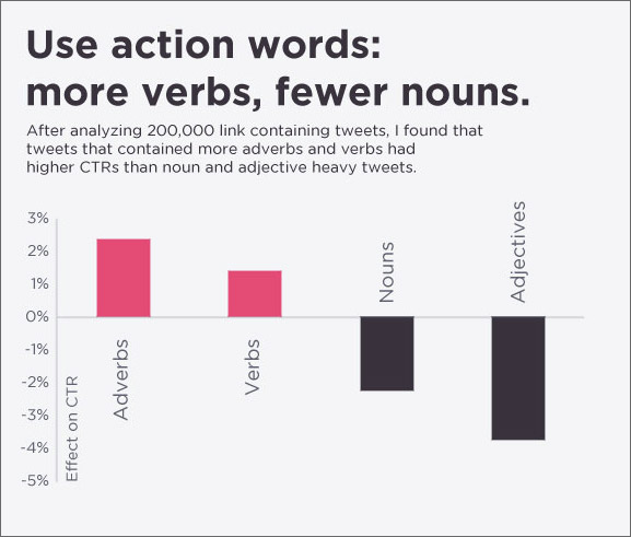
So the next time you tweet or share a link on your Facebook wall, ask your friends and followers to ‘retweet’, ‘share’, ‘Click’ and ‘like’ for better results.
3. Add some trust building elements
People are generally skeptical about registering or subscribing online because they fear it will leave them with an inbox full of spam or a lengthy form full of questions they do not plan on answering. Sometimes the copy of a call to action is so vague that it leaves the visitor confused about what lies on the next step. All these factors add on to an ineffective CTA. To clear ambiguity from the minds of website visitors, add some trust building elements. Here is an example;

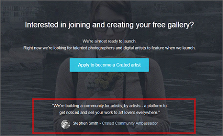
Sharing customer reviews just below the ‘buy now’ button helps online shopping stores quicken the buying decision. Similarly, sharing testimonials from satisfied customers about your service helps build trust. If you haven’t yet launched your business but wish to start marketing it, you will have a hard time convincing people about the quality of your product or service. Here is an example of someone doing that effectively:
Also Read: 101 things that might be driving website visitors away
4. Use the Whitespace smartly; but first, do use it
Copy, font style, size, graphics, and design are essential components of a call to action. Equally important is the space around that content. If everything around your button or link is gasping for space, then, there is a big chance that people will not even notice your most important button. If you ask us for an exact formula for leaving space around main button, we are sorry to say THERE IS NONE.
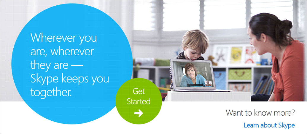
Skype uses clear spacing and design to bring focus to ‘Get Started’. This is their primary CTA and clearly gets more highlighted than the secondary CTA ‘Learn about Skype.’
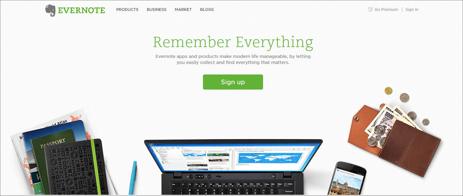
Evernote also uses a very clean ‘Sign Up’ CTA with a lot of white space around it, making it the centre of attraction despite lots of bold and clickable graphics and navigation options around it.
The smallest design element can make the biggest impact on sales figure
Consult expert before redesigning
5. Segment Your customers according to the buying process
Every marketer is trying hard to sell online and spending valuable resources towards the goal. But many are still ignoring the most critical factor; that is, segmentation of customers on the basis of their location in the buying process. A new visitor needs to be dealt differently as compared to a mature lead. Thus, CTAs that they will see should also be different.
A new visitor can be asked to download a free tutorial or ebook that will educate him better about an offered service. Directly asking him to buy something he is not even aware of will just scare him away.

A mature lead can be offered a free trial of the service. FATbit targets website redesign clients with the help of a CTA that offers a FREE report that provides website owners information about critical user experience and conversion website issues.

6. Set the mood with Colors
After conducting multiple tests, experts have suggested that buttons in colors like orange, green and red have a major impact on a buyer’s psychology and prompt them to click. Some have claimed to receive up to 90% higher click through rates.
However, some feel that it has more to do with the brightness and contrast. So, if your background color gives a good contrast to an orange, green or red button, we recommend you to use one. Your main CTA should be of different color than your background. Other less important CTAs can be just a different shade of the background.
If you do not believe in the color psychology, that’s fine too. A big and bright button with a color that contrasts it from the background is enough to get visitor’s attention. The button should look clickable and shouldn’t merge with surrounding elements. The example you see below fares well on all the parameters that make an effective CTA.

SalesForce however went a little too far while promoting their ebook. Their button is the same color as the background. Though aesthetically pleasing, they have tried to share a bit too much about their ebook through a banner that takes the focus away from main button.

Also Read: Colors & Conversions of a Website have a Deep Connection
7. Use CTA template
Every website owner does not have a dedicated design team to take care of content and graphic updates. Thus, a CTA template that can be reused over and over again can serve the purpose. Templates are quick to implement and save on repetitive design cost. It is also easier to test different versions of a CTA if you can easily update them with a new copy.

8. Keep a track on performance
Gmail tested 50 different shades of blue till they found the one that gets them the maximum conversions. Reputed companies regularly experiment with copy, color and size of their main CTAs for best results. Such vital aspects cannot be determined on intuition and designer’s whims. A/B testing of multiple CTA versions is necessary. Make updates on the basis of user behavior data furnished by Google Analytics and third party tools like CrazyEgg and ClickTale.
Mastering call to action elements is important if you want visitors to buy products and fill contact forms. In case you are still planning to use call to action button generators or CTA software to create the most important elements of your conversion funnel, then, you are on the wrong track. As mentioned above, call to action buttons vary from page to page, and require design expertise as well as marketing insights.
9. Use the Space Available for CTA Creatively
To engage visitors with CTA, it is important to use the space available for CTA smartly. To make your CTA stand out, you need to work on its design, position, and size of the CTA. The design of the CTA does not necessarily have to be rectangle, square or circle. It can be an image with text to naturally grab users’ attention. Such as the CTAs on Neil Patel’s blog:

You do want your CTA button to stand out, but increasing the size will not do the magic. The simple rule to decide the size of your CTA size is to make it big enough for it to stand out, but not so big that it distracts the visitors from the content of the web page.
As mentioned earlier, a visitor goes through website content from left to right. You need to strategically plan your CTA well so that it is noticed by the visitor. The location where you place your CTA also impacts its performance. You would want to try different locations- above the fold or below the fold to check which location has the most impact.
Do you think your website might be losing sales and traffic due to poor CTAs? Fill this form to request FREE website checkup that will tell you whether your call to action buttons are working at their best or not.
What else do you think contributes to an effective Call to Action? Share your ideas in the comment section!
Hire experts to test what works for your website and brings you more sales
Contact for a free website analysis


Comments (4)
 Khuram Dhanani
 Janice
 Blaine Hussey
 FATbit Chef Post author
My brother suggested I might like this website.
He was entirely right. This post truly made my day. You cann’t imagine just how much
time I had spent for this information! Thanks!
Lot’s of good information you have..Funny how color sets the stage of Websites.I have heard about the color chart for your “action buttons”..Thanks for the reminder..just wondering why the author doesn’t have a photo profile picture?
Thank you for sharing this information, it was very helpful.
I know this if off topic but I’m looking into starting my own weblog and was curious
what all is required to get set up? I’m assuming having a
blog like yours would cost a pretty penny?
I’m not very internet savvy so I’m not 100% certain. Any suggestions or advice would be
greatly appreciated. Kudos
Hi Blaine,
You can start your own blog with WordPress which is free. No technical skill are required to setup Free WordPress blogs but if you want some customization in design and functionality, you require some expert hands.
You can discuss your requirements with our blog design and development experts for free. Contact us