You incorporate best practices across your website to give visitors a user-friendly experience. However, if that experience diminishes upon reaching the contact page, do you think they will remain on your website? The bottom line is if you fail to entice the visitor into clicking that “contact” button, you literally have lost a potential customer forever.
There is a reason why it always adjudicated that a webmaster must never let their guard down when it comes to designing each part of the website. Even a simple contact us form can either result in a potential customer contacting you or just moving to another website. Creating an effective contact page involves a key process and one should abide by some crucial tips in order to ensure that the send button does not sit idle.
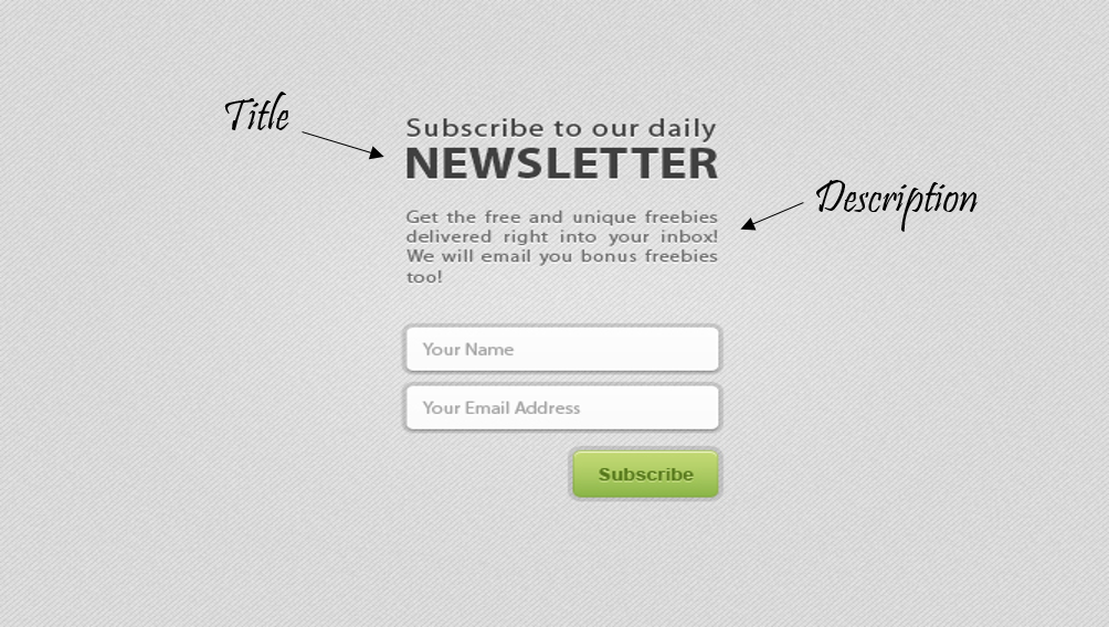
1. CLEAR AND CONCISE TITLE
Titles are meant to convey the crux of the matter, so avoid stories and tales. Be clear and precise with your title. The visitor should understand what the form is for, by just looking at the title.
2. INFORMATIVE DESCRIPTION
Although the title of the contact form should explain the contact form, in case the visitor still has any doubts and misconceptions, the description should come to your rescue. The description should answer- what is the need of the form and what will the visitor get in return of filling the form.
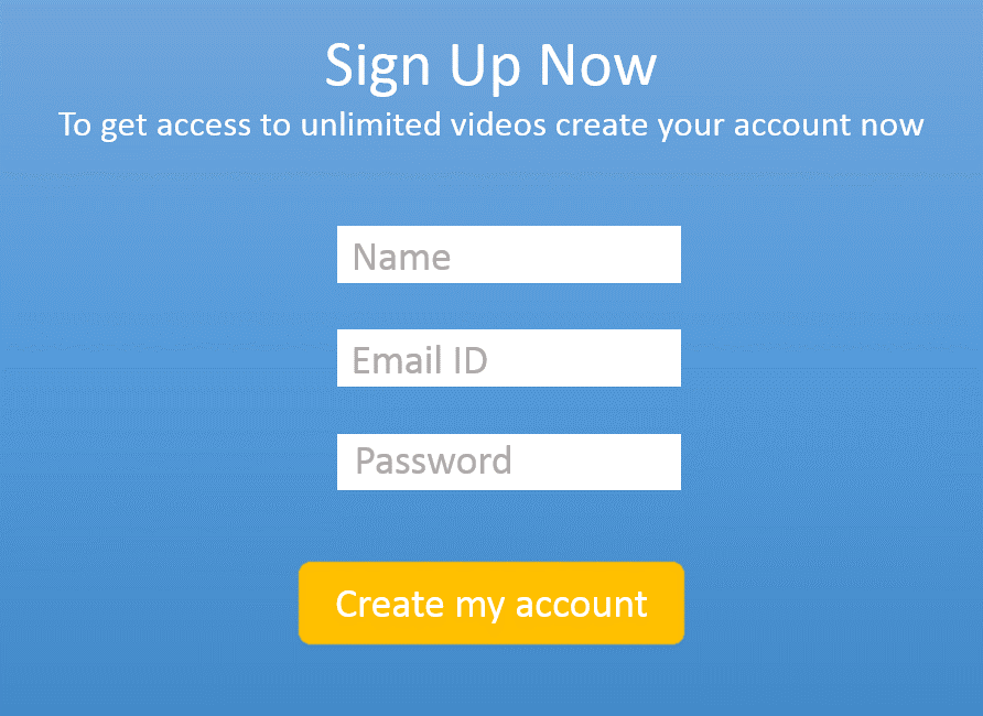
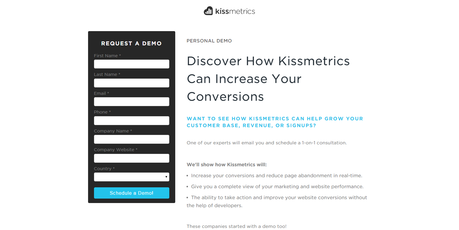
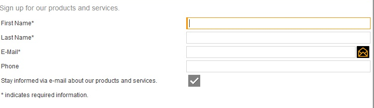
3. NO ONE LIKES LONG FORMS
Do not overdo your form with numerous fields. Use only those fields which are necessary and of utmost importance to your business. Avoid asking same information twice. Eg. Password – Confirm Password. Avoid asking for information, which is personal like Phone numbers, Spouse Name etc. In case you are asking such information, ensure the privacy of the user and communicate it using safety badges.
Given below are two options: Let us see which one do you like

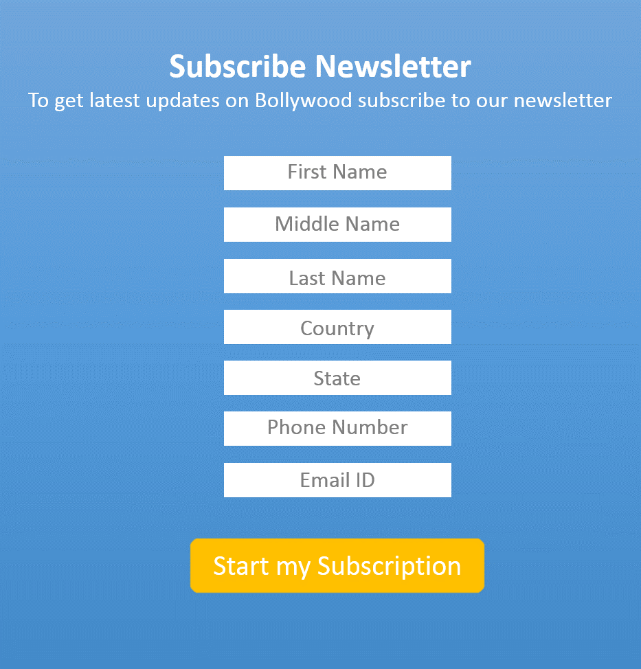
Which one do you think is most likely to be filled by the end user? Surely, the first one is a clear winner; the second option contains unnecessary fields, which can make the visitor hesitant about completing the form.
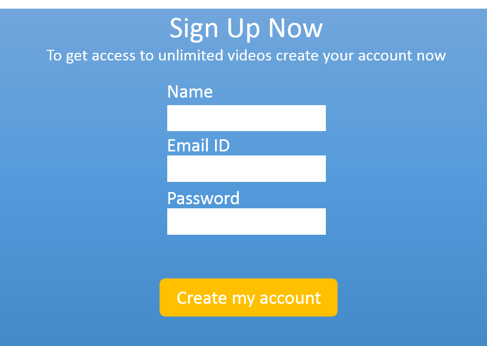
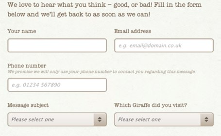
4. KEEP LABELS LEFT ALIGNED ABOVE THE FEILD
Eye tracking studies have shown that left aligned labels above the field perform better than the right and left aligned labels in line with the field. To make the form compact and short, labels can be placed inside the field.
Left Aligned inside the field:
Left Aligned above the field:
Left Aligned in line with field:

5. AVOID CONFUSING ACTION BUTTON
Using action buttons like Submit, OK, Continue, Done is the best way to confuse your visitors. So avoid using such buttons. An action button should always be reciprocation for filling the form and communicate what the visitor will get after he presses the action button.
6. PLACE THE FORM ABOVE THE FOLD
Doing this will encourage the visitor to focus more on the form itself and hence improve the rate of conversion. Keeping forms below the fold or spread across two folds of the page creates confusion and distraction.
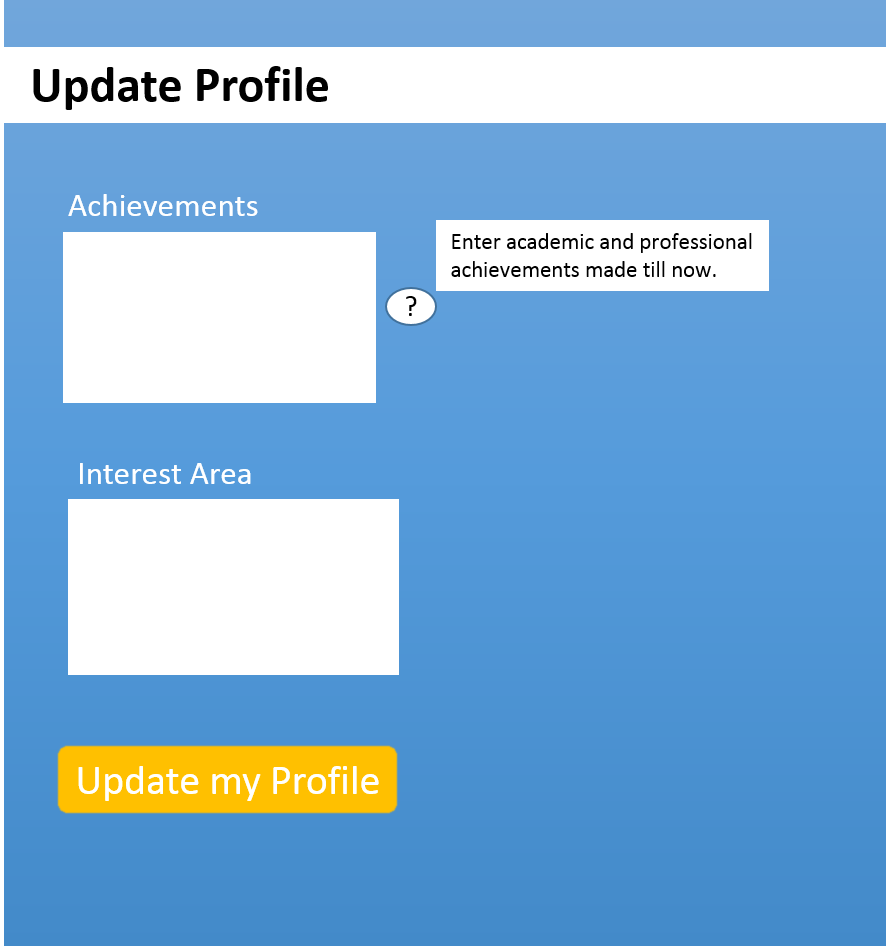
7. HELP VISITORS FILL FORM
Provide help text below the fields to guide user’s input. This way you are communicating the information as well as the format you are expecting from the visitor.
Eg: In the Email field you can write – “[email protected] “
If the fields are complicated Help option can be given to facilitate the user about the required input.
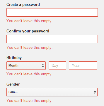
8. ALERT ERRORs CLEARLY
Communicate the errors clearly. Do not just show an error without communicating the reason for error as it can be irritating for the visitor to keep searching where he has gone wrong.
9. HIGHLIGHT FIELDs
While the visitor is filling a specific field highlight that field, so that in case the visitor gets distracted he can quickly come back and resume from where he left. Also, save time by automatic cursor placement in the first field.
10. FONT SYLE, SIZE & BACKGROUND COLOUR
Readability of form is very important, so make sure the font style, size, and color do not hinder the reading. Avoid using funky font styles and color schemes, which make reading difficult. For Eg: Light gray background with white text.
11. DEMARCATE BETWEEN THE REQUIRED AND OPTIONAL FIELDS
Best and easiest way to differentiate between the required and optional fields is using the asterisk (*) sign. This will improve the user experience and hence the conversion rate.
12. USE MOBILE FRIENDLY FORMS
With the number of mobile users going up, it is very important to design a form, which provides a good user experience to mobile users. So invest in optimizing your fields for mobile use.
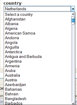
13. AVOID CROWDED DROP DOWN MENU OPTIONS
A drop down menu loaded with numerous options can confuse the visitor and they can end up saying Good Bye to your page. So use drop down menu wisely. In case you have a large number of options, using an Auto Complete will be a better option.
14. PERSONALIZE MESSAGE AFTER FORM IS SENT
Let your visitors know what will happen after the form is sent. Display a personalized message, which would include the name entered by the visitor telling helpful details like how long will it take for someone to follow-up or any other relevant info.
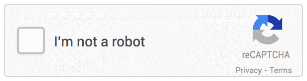
15. USE SIMPLE CAPTCHA
Although Captcha is an anti-spam measure but can prove extremely annoying if the visitor is unable to get captcha right the first time and you end up scaring off visitor from your page. To overcome this necessary evil, use simple captcha and give the option of changing the code.
Eg: Use something like this, just simple checkbox:
CONCLUSION
In the end, when it comes to designing a contact form, it all boils down to creating a form that is precise, relevant, personalized and easy to fill. Rather than having a loud form with its focus on high-quality graphics, the contact form ought to usher in the fastest way to contact you. In addition to that, you should also keep the form engaging, so that the visitor does not abandon it midway. Do you have some good examples of such contact forms? Feel free to start a conversation in the comments below.
Build an effective contact form for your website


Comments (4)
 Ad Campaigns
 FATbit Chef Post author
 Kay
Kay
 FATbit Chef Post author
Hi Ketan,
Great tips on building a contact form. Contact forms are just as important as ad campaigns because they both aim to grow your audience, so they should be treated as such.
Thanks,
Dennis
Thanks for appreciating the post. Yes you are absolutely right without great contact forms ad campaigns are nothing.
Cheers,
Ketan
This is cool. I love your designs. I will try to recreate them,
Thanks!!
Glad you liked it.
Cheers,
Team FATbit.